Graphic design
fromThe Verge
13 hours agoReally, you made this without AI? Prove it
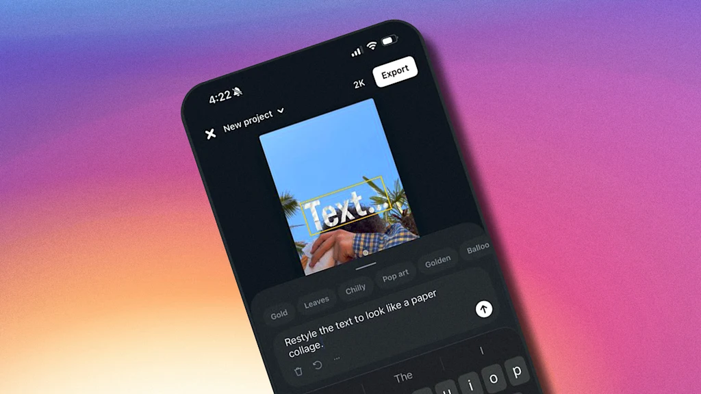
Labeling human-made content is essential as AI-generated works proliferate, creating confusion and skepticism among audiences.
Elisava's Master's in Graphic Design is ingrained with societal, cultural and critical contributions to the creative industry, going beyond its aesthetic output while fostering self-awareness in creatives.
The longer we wait, the more difficult it will become to remedy the damage. Since 2019, state funding had all but dried up, forcing the foundation to auction works to raise funds to continue the restoration of both the iconic building and its many site-specific works.
Like the chambered nautilus, its shell was a logarithmic spiral. A wall of rough sandstone and aquamarine glass cullet twisted up fifty feet to an oil-drill-stem mast from which a floating roof was hung by the stainless-steel struts of World War II biplanes. You slid in with the humid air from the ravine outside to stroll a terraced garden of pools and plants, over which suspended and carpeted pods for living and sleeping drifted like clouds.
The ridges of eucalyptus bark, the geometries of shell formations, moss-covered trees, Indigenous grasslands and the hidden networks of fungi beneath the soil. These landscapes produce organic yet abstract patterns - natural systems that quietly shape the way we see and design the world around us.
Designed by artists and designers from across the globe, each wallpaper comes in a variety of screen resolutions and can be downloaded for free. A huge thank-you to everyone who shared their designs with us - this post wouldn't be possible without your kind support!
Static images don't show motion. You can't inspect real product structure. You don't see how interfaces evolve over time. You rarely understand what actually works in production. So I decided to go deep. I reviewed every major design reference platform I could find - not just the popular ones - and analyzed how they actually help in real-world work. The conclusion?
We needed a visual identity that was uniquely Getty and distinct enough to unify how we show up globally. This system gives Getty one clear, ownable expression in support of the work we do around the world.
We might be exposed to more ads and commercials today than ever before in human history, but the idea of advertising itself is certainly not a new concept. According to Instapage, the first signs of advertisements actually appeared in ancient Egyptian steel carvings from 2000 BC. Meanwhile, the first printed ad was published in 1472, when William Caxton decided to advertise a book by posting flyers on church doors in England.
One thing I spent a lot of effort on is getting edges looking sharp. Take a look at this rotating cube example: Try opening the "split" view. Notice how well the characters follow the contour of the square. This renderer works well for animated scenes, like the ones above, but we can also use it to render static images: The image of Saturn was generated with ChatGPT.
Massaranduba, the small agricultural town in the south of Brazil that Pedro grew up in is far from sci-fi, but this graphic designer's imagination takes him some place else. From posters, illustration, magazine layouts and typefaces (such as pieces that focus on sci-fi author Ursula K. Le Guin 's fictional Kesh alphabet), Pedro works digitally with a focus on textures and grit, using dithers and fractals to build upon visual world's textures. His projects are "mood-centred", which begin by assembling references from all over to refine feelings that are conjured up by consuming films, fashion, music and other visual forms.
Infused with history, the slab cannot help but suggest the old West's frontier clichés, for such ephemera as classic wanted posters, political broadsides, cautionary warning signs, and more generic commercial applications. Cattivo is a brand-new 18-font family that, when used in any weight and size, cuts through nostalgic predictability and provides a welcome alternative to such popular Egyptian-style slab serifs as Stymie and Memphis.
The main problem with the existing homepage was that, besides the most recent posts, other content, once it aged and 'fell off' the front page, was then difficult to discover. The new design makes more use of available screen 'real estate', is visually much richer, and reorganizes 18 years of posts, so that even older long-forgotten posts are more easily found.
A graphic designer that isn't limited to working in 2D, Ward Goes has been working in aluminium of late. His recent solo show in Rotterdam, Literally Anything, was full of things that moved beyond the screen or printed page, including some wonderful metal signage and archival storage. The exhibition at Alley Space was the result of the designer's decision to pursue more tactical investigations alongside his commissioned work at the start of 2025.
Blackletter typefaces elicit many contradictory emotions depending, of course, on the context in which they are used and the manner in which they are composed. Sometimes they bark commands - STOP or BEWARE. Other times they are comforting in an ecclesiastical way - Christmas and Easter greetings. During World War II Blackletter was menacing for those in occupied lands who read it as exclusionary - as in FORBIDDEN or DANGER; others accepted it as patriotic