UX design
fromSmashing Magazine
3 days agoA Practical Guide To Design Principles - Smashing Magazine
Design principles align teams, inform decisions, and embody organizational values, serving as essential tools in the design process.
Elisava's Master's in Graphic Design is ingrained with societal, cultural and critical contributions to the creative industry, going beyond its aesthetic output while fostering self-awareness in creatives.
Designed by artists and designers from across the globe, each wallpaper comes in a variety of screen resolutions and can be downloaded for free. A huge thank-you to everyone who shared their designs with us - this post wouldn't be possible without your kind support!
Static images don't show motion. You can't inspect real product structure. You don't see how interfaces evolve over time. You rarely understand what actually works in production. So I decided to go deep. I reviewed every major design reference platform I could find - not just the popular ones - and analyzed how they actually help in real-world work. The conclusion?
We've both fought against needless promotional content before and lamented that frontier AI platforms are falling into the same pattern. As designers and users, we've learned that "free" usually means putting up with interruptive, slightly creepy ads that feel more like a tax than a benefit - a frustration tax that now colors how we approach free‑tier services and now AI tools.
I furnished my last design studio with bespoke Danish shelving, three Eames desk units, nine glass tables, 12 chairs, etc. When I closed the studio I moved the furnishings plus a few hundred design books-including books I'd written, foreign translations of my work, books by other designers that I'd published, translations of some of those books, oversized and rare design books, books signed by their authors and sent to me, and so on.
In his graphic design work, Aldon transforms periodic tables and dense masses of information into maximalist pieces of design, expressing information whilst also challenging the impossibility of taking it all in. Data sprawls across screens and pages, overlapping in overloads and feedback loops, communicating more the aesthetic of information rather than its substance, playing with images we have all seen in science classes or colour palettes. These are exploded infographics.
In Andor, I got chills when Mon Mothma warns the senate of a chilling truth: When we let noise, conformity, or fear dominate, we lose sight of what matters. We risk allowing the loudest voices, often the safest, the most predictable, to drown out individuality, identity, and truth. To me, this line... This line echoes a growing tension I feel in content design.
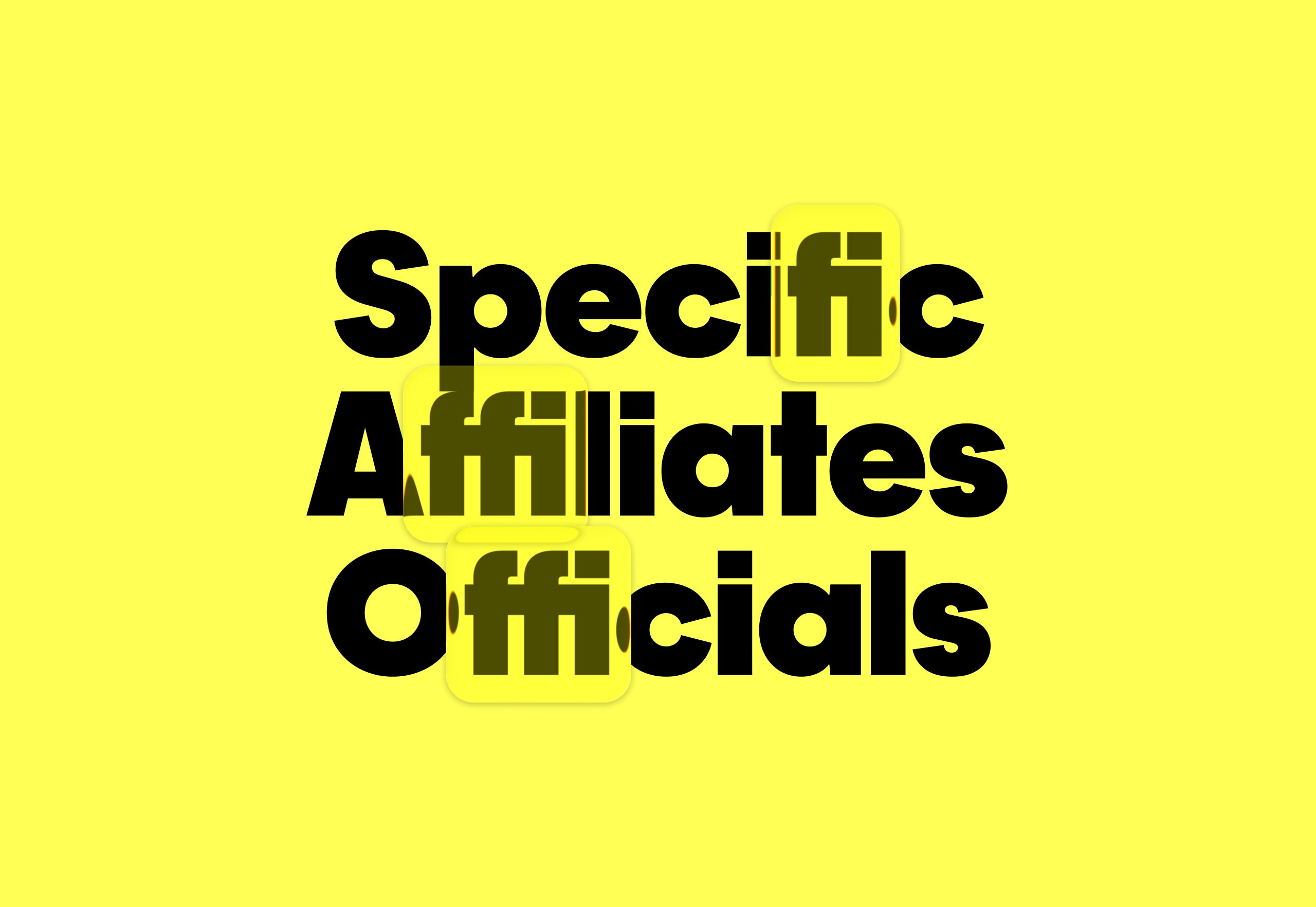
One predictable pain point with contrast-color() is that it only returns black and white named colors. From a design systems perspective, that's not ideal because you want your colors. You want your harmonious brand and the colors you and your team spent thousands of man hours in meetings deciding on. Those colors. In fact, an earlier version of Safari had color-contrast() (confusing I know, naming is hard) which allowed you to pass in a list of best candidates to choose from. I beleive that proposal got mired in standards discussions, color contrast algorithms, and competing proposals; and contrast-color() is what survived which got simplified down to a binary result.
Linear-style UIs look simple, but the theming system has to do real work. Here's how to meet WCAG 2.2 contrast requirements across light, dark, and high-contrast modes whether you're using a UI library or rolling your own tokens.
The main problem with the existing homepage was that, besides the most recent posts, other content, once it aged and 'fell off' the front page, was then difficult to discover. The new design makes more use of available screen 'real estate', is visually much richer, and reorganizes 18 years of posts, so that even older long-forgotten posts are more easily found.
Blackletter typefaces elicit many contradictory emotions depending, of course, on the context in which they are used and the manner in which they are composed. Sometimes they bark commands - STOP or BEWARE. Other times they are comforting in an ecclesiastical way - Christmas and Easter greetings. During World War II Blackletter was menacing for those in occupied lands who read it as exclusionary - as in FORBIDDEN or DANGER; others accepted it as patriotic
Teams often use customer and user interchangeably until it breaks alignment. Here's how separating the two clarifies research, prioritization, and messaging across B2C, B2B, and B2B2C products.
Infused with history, the slab cannot help but suggest the old West's frontier clichés, for such ephemera as classic wanted posters, political broadsides, cautionary warning signs, and more generic commercial applications. Cattivo is a brand-new 18-font family that, when used in any weight and size, cuts through nostalgic predictability and provides a welcome alternative to such popular Egyptian-style slab serifs as Stymie and Memphis.
A graphic designer that isn't limited to working in 2D, Ward Goes has been working in aluminium of late. His recent solo show in Rotterdam, Literally Anything, was full of things that moved beyond the screen or printed page, including some wonderful metal signage and archival storage. The exhibition at Alley Space was the result of the designer's decision to pursue more tactical investigations alongside his commissioned work at the start of 2025.