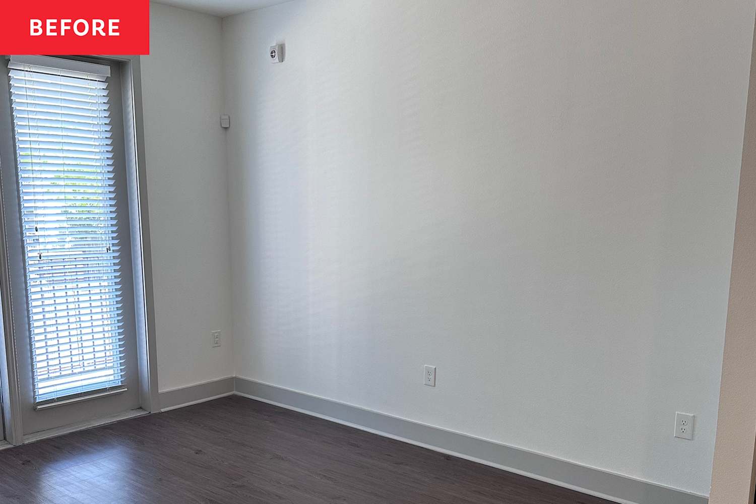
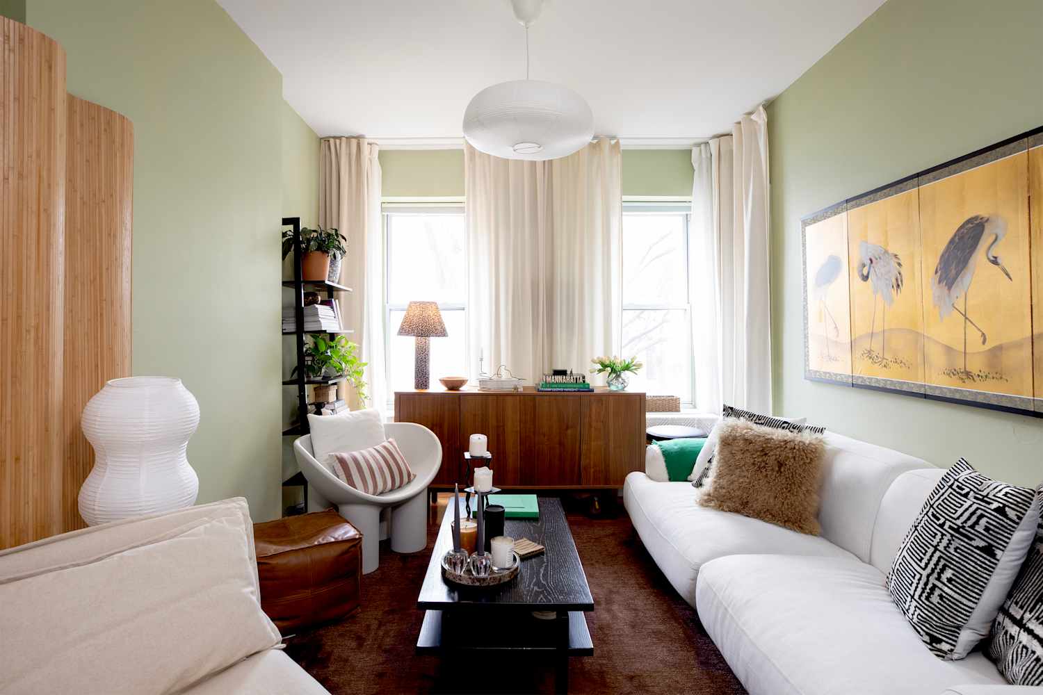
#color-and-material
#color-and-material
[ follow ]
#interior-design #home-decor #design #color-psychology #home-improvement #sustainability #color-perception


fromTravel + Leisure
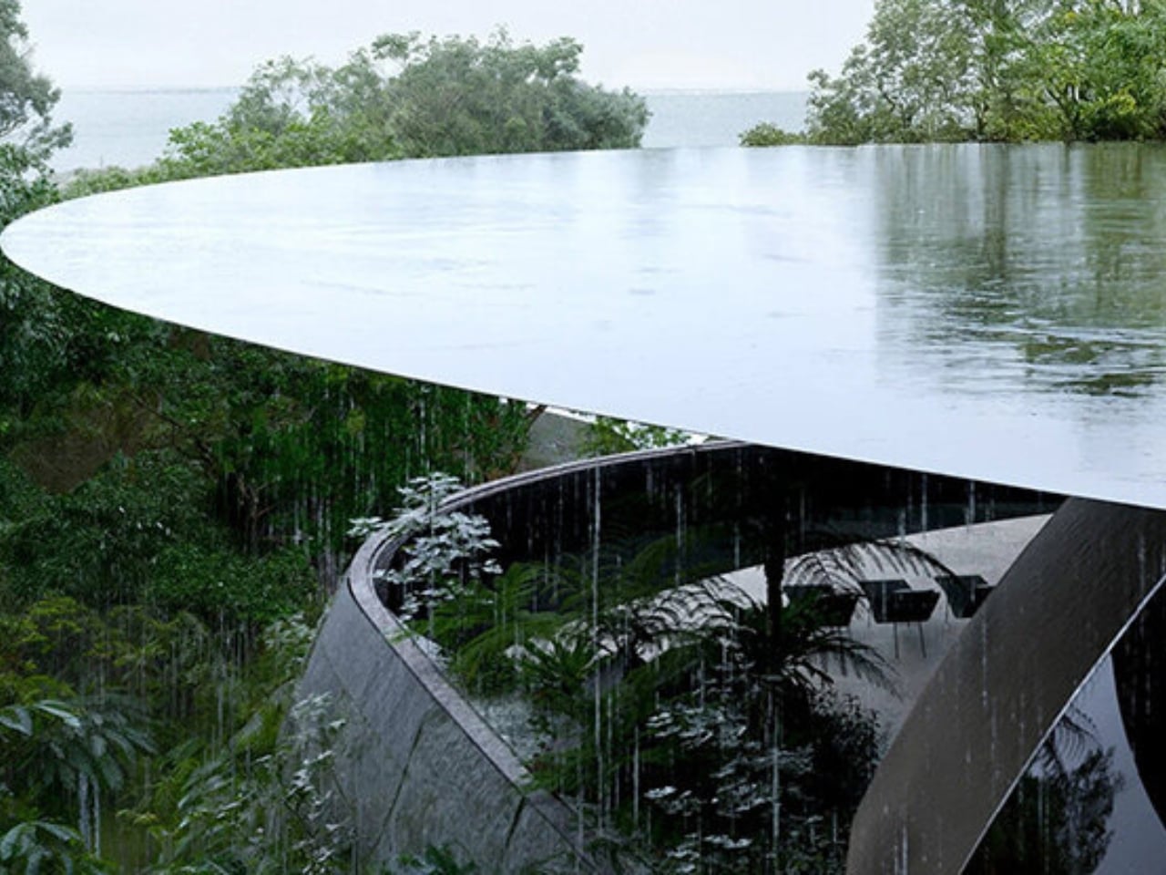
2 days agoWhat Actually Makes Some Ocean Water Such a Vibrant Turquoise Color-the Science Behind That Dreamy Shade
When light shines through water, colors with longer wavelengths are absorbed by the water, with the longest wavelengths absorbed first. Blue and violet have the shortest wavelengths of visible light, so they are able to penetrate the deepest.
Travel


Alternative transportation
fromSustainable Bus
5 days agoNew certified Ultrafabrics collections target durability and compliance in passenger transport interiors - Sustainable Bus
Ultrafabrics launches new certified collections for passenger transport, combining durability, aesthetics, and sustainability in high-performance upholstery fabrics.
fromMail Online
6 days agoWhat colour are the dots in this optical illusion?
'In this paper a novel optical illusion is described in which purple structures (dots) are perceived as purple at the point of fixation, while the surrounding structures (dots) of the same purple colour are perceived toward a blue hue.'
Science

fromArchitectural Digest
3 days agoI'm Done Sourcing So Much Online. Here's Why
The convenience of sourcing online is fraught with more pitfalls than most of us want to admit. Try finding adequate photos of a vintage piece's condition-close-ups of the fabric, video of damaged areas, any images of a piece's rear or underside!
UX design
fromColossal
2 weeks agoBreezy Swathes of Fabric Dance Amid Landscapes in Thomas Jackson's Photos
Rooted in the tension between nature and artificiality, the installations pose questions about how we interact with the environment and how we might find equilibrium with it. All of my photographs strain credulity by design. At first blush, they can appear to be digital fabrications, but in truth, they are entirely in-camera, printed with minimal post-production.
Photography

Design
fromdesignboom | architecture & design magazine
6 days agoartwork uses floating fabric corridor and bodily movement to visualize climate change
Ryo Yamada's Perception Corridor is an immersive installation in Edinburgh that explores perception and environmental awareness through a 40-meter fabric corridor.
Design
fromdesignboom | architecture & design magazine
2 weeks agoa rich palette of saturated hues meet industrial precision in mara's renewed digital identity
Mara enters 2026 as a global interior design protagonist, expanding from office and hospitality into residential markets while strengthening its digital identity and sustainability commitment.
fromwww.architecturaldigest.com
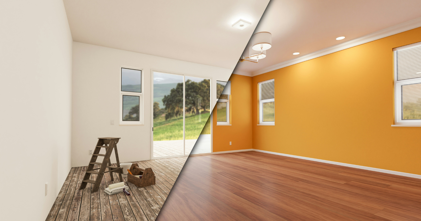
2 weeks agoNon-Toxic Paint 101: A Designer-Approved Guide
Even long after the tell-tale odor of new paint has vanished, traditional paint can off-gas for months, releasing volatile organic compounds (VOCs) that have been linked to organ and nervous system damage, cancer, and infertility.
Remodel
#lighting-design

Renovation
fromRedfin | Real Estate Tips for Home Buying, Selling & More
3 weeks ago5 Reasons Why Lighting Design Matters More Than You Think in Home Interiors
Thoughtful lighting design enhances home comfort, style, and well-being by supporting circadian rhythms and transforming how spaces feel and function.
Design
fromApartment Therapy
3 weeks agoDesigners Are Done Perfectly "Matching" Their Marble - Here's the New Way to Use Stone
Modern stone design in 2026 prioritizes mixing different stones intentionally with varied finishes and embracing natural patina, replacing the outdated approach of matching all stone surfaces uniformly throughout spaces.
fromdaverupert.com
2 months agoUsing your design system colors with contrast-color()
One predictable pain point with contrast-color() is that it only returns black and white named colors. From a design systems perspective, that's not ideal because you want your colors. You want your harmonious brand and the colors you and your team spent thousands of man hours in meetings deciding on. Those colors. In fact, an earlier version of Safari had color-contrast() (confusing I know, naming is hard) which allowed you to pass in a list of best candidates to choose from. I beleive that proposal got mired in standards discussions, color contrast algorithms, and competing proposals; and contrast-color() is what survived which got simplified down to a binary result.
fromDefector
1 month agoMake It Nice: Curtains, Linens, And How To Figure Out What You Like | Defector
My husband and I just upgraded our apartment here in Germany to one with much more space. The downsides of this is we have hard marble floors and a tall-ceilinged living room (oh woe is us!). It's very echo-y and looks directly into our neighbors across the street. The windows have external shutters, so light-blocking isn't needed, but we'd love to get
Design
fromDocumentjournal
1 month agoOnce upon a time, fashion got dirty
In the show, "dirty" extends to anything that breaks fashion's pact with propriety. Here are clothes caked in grime, blotted with makeup, stiffened by salt, pieced from trash, frayed, and faded. The garments span decades, from the 1980s through the mid-2000s, when the likes of Vivienne Westwood and Jean Paul Gaultier built their fame on defying convention, to today, when corporatization has made such daring increasingly rare. But forgoing practicality frees certain designers from the demands that the body be polite-and thereby policed.
Fashion & style
fromDesign Milk
1 month agoThe 2026 Color Collection by 3form is Rooted in History
The 2026 Color Collection from 3form highlights hues that have anchored design across generations and cultures for thousands of years. The brand's sixth grouping is a departure from last year's palette, which emphasized the emotional power of select shades. With the guiding theme "Color that Connects," the new line features tones that are celebrated by communities around the globe. Inspiration for the palette came from exploring natural pigments used to make certain colors, and how they were found in various locales over time.
Remodel
Design
fromwww.architecturaldigest.com
2 months agoWhite Walls Driving You Crazy? Patterned Sheets Are Certainly Cheaper Than Painting
Patterned sheets add texture, dimension, and affordable, easy-to-change style using high-quality, breathable materials and Oeko-Tex certified, chemically safe construction.
fromDesign Milk
2 months agoDesigntex + nanimarquina Introduce New Textiles as Acts of Care
The collaboration brings together Designtex's deep expertise in high-performance contract textiles and nanimarquina's poetic command of craft, tactility, and the beauty of the imperfect. For both teams, the partnership emerged from an immediate sense of kinship - a shared language of material integrity, color sensitivity, and a respect for heritage techniques reinterpreted for contemporary spaces. "We did that by using performance yarns and intentionally embedding imperfections into the weaving process."
Design
fromApartment Therapy
2 months ago"Instantly Calming": 8 Colors Designers Love in Trendy Japandi Interiors
If there was only one interior design style setting the tone in 2026, it would be Japandi. Apartment Therapy's State of Home Design survey identified Japandi style as one of the year's top design aesthetics, according to insights from 140 designers - and it's easy to see why. As more people strive to create spaces that feel calming, intentional, and grounded in nature, Japandi's blend of Japanese restraint and Scandinavian warmth feels especially timely.
Design
[ Load more ]