UX design
fromSmashing Magazine
3 days agoA Practical Guide To Design Principles - Smashing Magazine
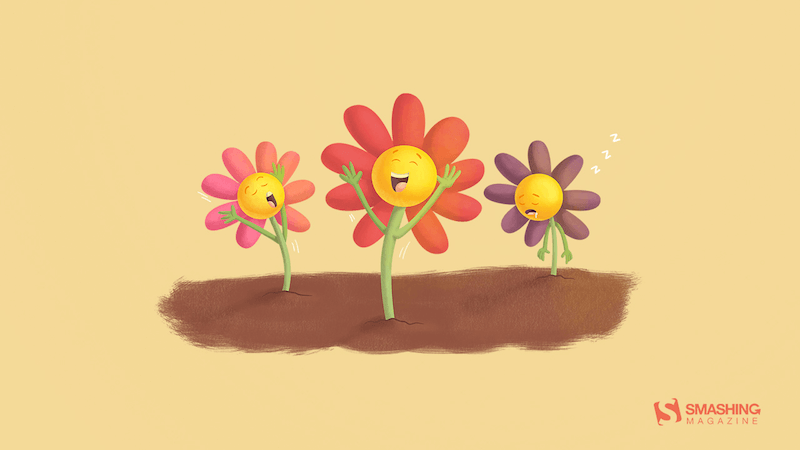
Design principles align teams, inform decisions, and embody organizational values, serving as essential tools in the design process.
'In this paper a novel optical illusion is described in which purple structures (dots) are perceived as purple at the point of fixation, while the surrounding structures (dots) of the same purple colour are perceived toward a blue hue.'
Static images don't show motion. You can't inspect real product structure. You don't see how interfaces evolve over time. You rarely understand what actually works in production. So I decided to go deep. I reviewed every major design reference platform I could find - not just the popular ones - and analyzed how they actually help in real-world work. The conclusion?
From Do Ho Suh's ethereal architecture to Kimsooja's irridescent mirrors to Lauren Halsey's fringed tapestry, a new book from Monacelli celebrates a broad spectrum of light and color. Rainbow Dreams features more than 200 installations, sculptures, paintings, photographs, and more that revel in the possibilities of pigment. Bound in a smooth gradient that extends to the pages' edges, this vivid survey is a celebratory, playful object in itself.
There have been a few drafts of a specification function for this functionality, most recently, contrast-color() (formerly color-contrast()) in the CSS Color Module Level 5 draft. But with Safari and Firefox being the only browsers that have implemented it so far, the final version of this functionality is likely still a ways off. There has been a lot of functionality added to CSS in the meantime; enough that I wanted to see whether we could implement it in a cross-browser friendly way today. Here's what I have: color: oklch(from <your color> round(1.21 - L) 0 0);
Architect-turned-interior designer Anh Ly, founder and CEO of Mim Concept, explains why the color surged in the first place: "Butter yellow had a magic moment because it felt optimistic and comforting, especially during a time when people were craving warmth at home." Now, that emotional pull is also what's working against it. "It fell short on resale since it's a very emotion-specific color. Buyers tend to see it as personal rather than neutral, which makes it harder for them to imagine themselves in the space," Ly adds.
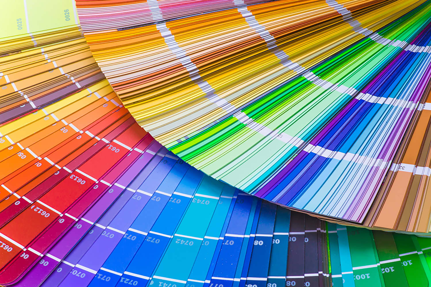
Its newest, though, is a single-fan book with more than 600 spot colors, and it's priced at just $99. Pantone for beginners. Pantone on Thursday announced its Pantone Capsule: Signature Edition. Housed in a collectible, cylindrical case that wouldn't look out of place in a Sephora, the guide is a sort of Pantone 101 that come on coated and uncoated paper stock with colors selected from across more than 60 years of Pantone history.
Real estate with ocean views, stunning mountain vistas, and wide-open green spaces sell at premium prices because humans find those settings pleasing [1-5]. Certain color combinations in fashion-such as brown and forest green-blend harmoniously, while others, such as hot pink and orange, clash. And our eyes like certain proportions in visual objects (like buildings and human faces) but not others.
We examine the online debate ignited by Pantone's Colour of the Year, Cloud Dancer. This episode dives into the discussion prompted by Pantone, unpacking the uneasy relationship between colour and fascism. From hardline efforts to regulate colour in public life to the ways vibrancy and maximalism reassert themselves, we explore how colour becomes a quiet form of resistance across art, fashion, film, and design.
One predictable pain point with contrast-color() is that it only returns black and white named colors. From a design systems perspective, that's not ideal because you want your colors. You want your harmonious brand and the colors you and your team spent thousands of man hours in meetings deciding on. Those colors. In fact, an earlier version of Safari had color-contrast() (confusing I know, naming is hard) which allowed you to pass in a list of best candidates to choose from. I beleive that proposal got mired in standards discussions, color contrast algorithms, and competing proposals; and contrast-color() is what survived which got simplified down to a binary result.
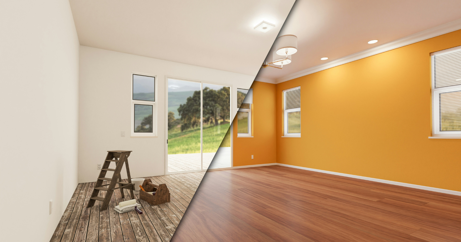
Making a small bathroom both beautiful and functional is a tall task; after all, they're often short on light, floor space and lofty ceilings. Creating a design for tiny bathrooms should focus on using every inch of space effectively - but since each of these spaces (no matter how small!) have walls, a paint color may be your most important choice.
Linear-style UIs look simple, but the theming system has to do real work. Here's how to meet WCAG 2.2 contrast requirements across light, dark, and high-contrast modes whether you're using a UI library or rolling your own tokens.
Design tokens are all your design decisions, that define a design system's aesthetic properties, everything from colors and font sizes to spacing units and border radii. They are the modern evolution of hard-coded values. They are stored in a central, platform-agnostic repository, establishing a single source of truth for your entire digital product suite. This central management allows teams to consume the exact same design values across all platforms (web, native apps, documentation).
In Andor, I got chills when Mon Mothma warns the senate of a chilling truth: When we let noise, conformity, or fear dominate, we lose sight of what matters. We risk allowing the loudest voices, often the safest, the most predictable, to drown out individuality, identity, and truth. To me, this line... This line echoes a growing tension I feel in content design.
Nano Banana Pro (Gemini 3 image model) is particularly strong for UI design because of its 99% text accuracy, its ability to understand spatial layout, and its support for high-resolution 4K output. In this article, I want to share my 5 favorite cases of using this model for UI design tasks. ( Quick note: I won't dive into a critique of the output generated by AI in this article, letting you decide whether you like it or not)