UX design
fromMedium
5 hours agoYou're not supposed to get it right
Design challenges for UX writers can be intimidating due to the pressure of making quick, impactful decisions and the emphasis on visual elements.
Santa Cruz de Tenerife is one of the most idyllic cities in the Canary Islands. At its heart stands the jewel - the Auditorio. It's a place where talent from both worlds, New and Old, comes together. A theatre, opera, dance, and music heaven.
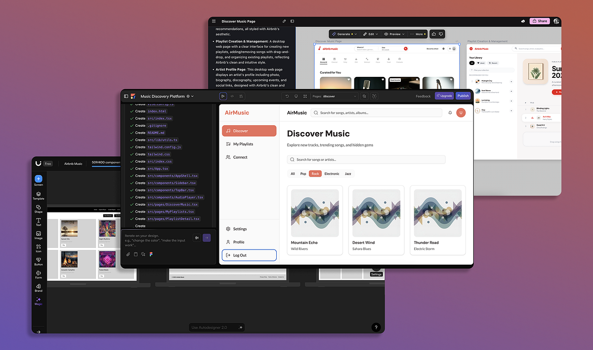
If you ask Claude to generate a web page for you, there is a high chance you will get a very generic output. The page serves a functional purpose, but it's not very appealing. You can see that this design clearly serves the functional purpose, but doesn't look very appealing.
Google recently released a new AI model, Gemini 3.1, that demonstrates great results in UI and web design tasks. I've already tested this model for web design tasks and in this article, I want to experiment with Gemini 3.1 and generate UI for a mobile application.
Instructions I created. Instructions I am continuing to hone - instructions that required me to study my own old essays, identifying what I do when I write. The sentence rhythms. The way I move between timescales. The zooming in and out from concept to detail. The instructions tell Claude how I would like ideas composed. I pull together concepts and experiences from my lived expertise to formulate a point of view - in this case, on this new AI technology.
Here's the sad truth about sports score apps: Most of them aren't all that interested in actually telling you the score. After all, where's the money in providing straightforward information like that? The modern sports score app has to do more. It must bombard you with banner ads and betting odds, implore you to create an account and opt into notifications, sell you some tickets, and show some videos to keep engagement up. The scores themselves are an afterthought.
Performance is a critical factor in user engagement, where even minor delays in loading can deter users. A clean and simple user interface also contributes significantly to user retention.
Today we are at the cusp of revolutions in artificial intelligence, autonomous vehicles, renewable energy, and biotechnology. Each brings extraordinary promise, but each introduces more complexity, more interdependence, and more latent pathways to failure. This elevates prudence to be critical. Good design recognizes what cannot be foreseen. It acknowledges the limits of prediction and control. It builds not merely for performance, but for recovery.
In Andor, I got chills when Mon Mothma warns the senate of a chilling truth: When we let noise, conformity, or fear dominate, we lose sight of what matters. We risk allowing the loudest voices, often the safest, the most predictable, to drown out individuality, identity, and truth. To me, this line... This line echoes a growing tension I feel in content design.
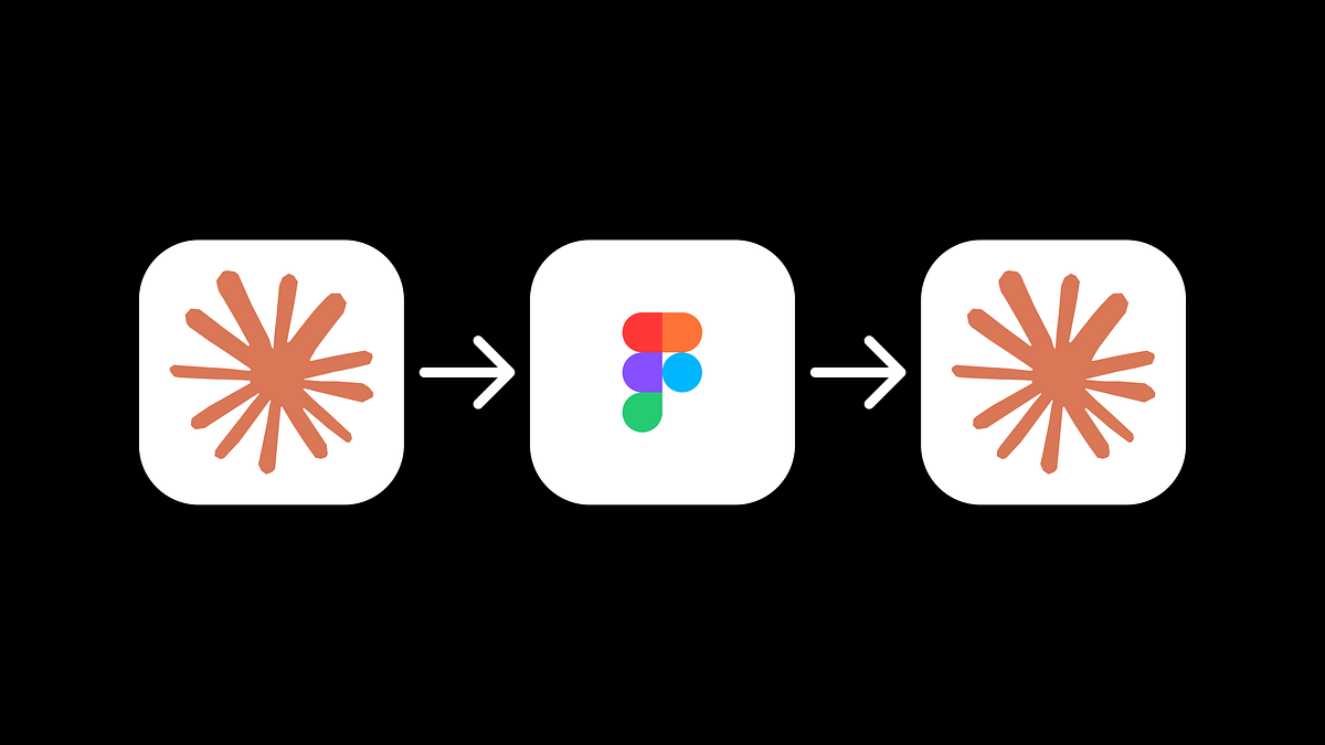
Something's been slowly shifting in the design zeitgeist. I've been watching my feed on X and the vibe has changed. More and more, I see designers sharing finished experiments or prototypes they coded themselves, rather than static Figma files. Moving from working on a canvas to talking to an LLM. The conversation isn't "here's a design I made" anymore... it's "here's something I shipped this afternoon."
AI is disrupting more than the software industry, and is doing so at a breakneck speed. Not long ago, designers were deep in Figma variables and pixel-perfect mockups. Now, tools like v0, Lovable, and Cursor are enabling instant, vibe-based prototyping that makes old methods feel almost quaint. What's coming into sharper focus isn't fidelity, it's foresight. Part of the work of Product Design today is conceptual: sensing trends, building future-proof systems, and thinking years ahead.