#free-characters
#free-characters
[ follow ]
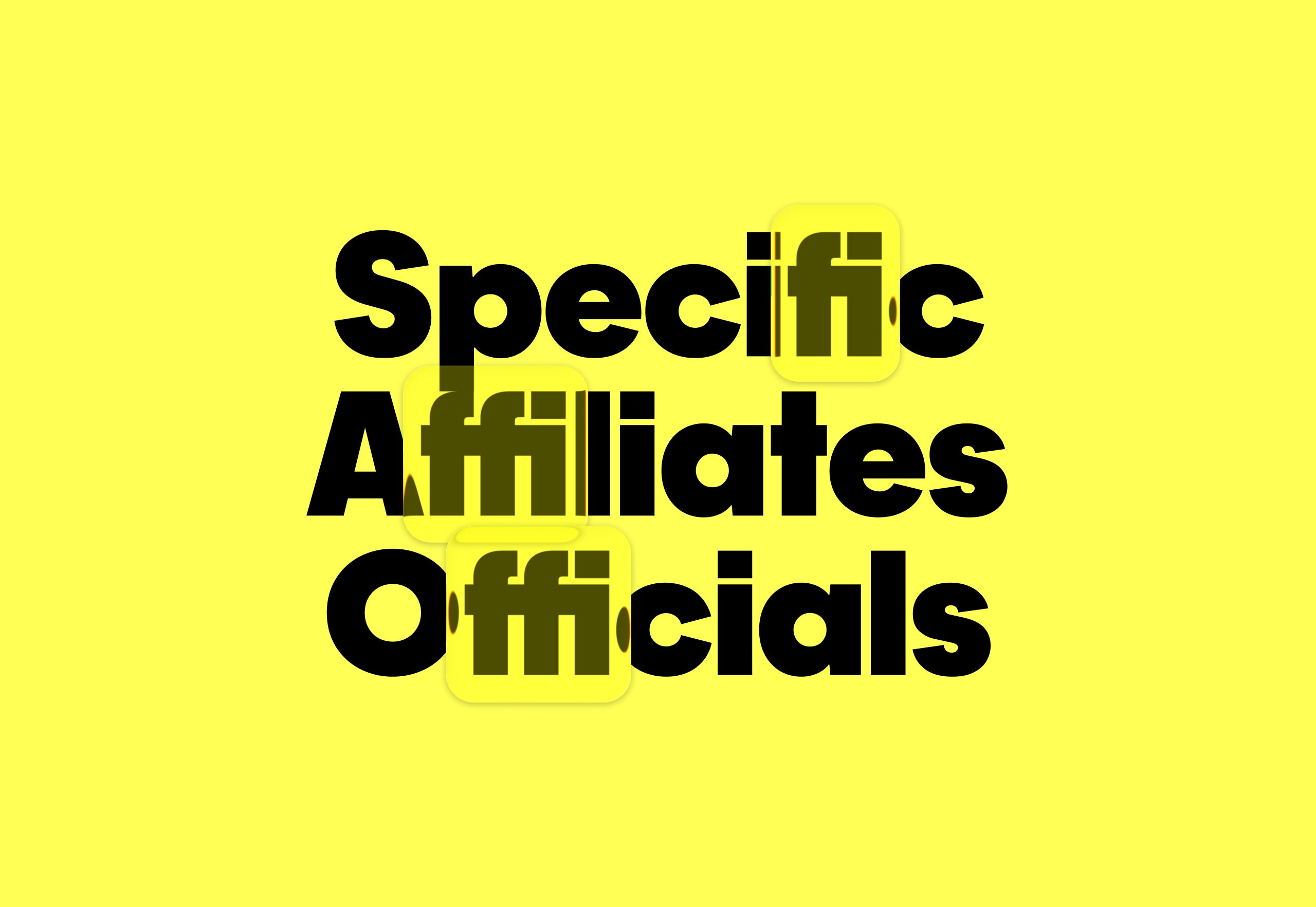
#typography #graphic-design #design #illustration #ai #typeface-design #legibility #ai-image-generation #photography
fromItsnicethat
4 days agoElisava's Master's in Graphic Design is about what design can do for others, and what you can do for design
Elisava's Master's in Graphic Design is ingrained with societal, cultural and critical contributions to the creative industry, going beyond its aesthetic output while fostering self-awareness in creatives.
Barcelona

fromItsnicethat
3 days agoBravas Graphix are the rave connoisseurs behind some of Brussels' most explosive posters
"We're constantly striving to strike a balance between work that respects academic rules of composition, established visual codes and good readability, with something more spontaneous, adventurous, playful, even naive."
Typography
#typeface-design


Typography
fromItsnicethat
2 weeks agoKimera foundry on having its typeface front the Oscar-winning film, Sentimental Value
Kimera Foundry, founded by Michael Clasen, conducts rigorous research to translate historical design ideas into contemporary typefaces that function within modern technology requirements.
Typography
fromI Love Typography Ltd
1 month agoSteven Heller's Font of the Month: Curve Display - I Love Typography Ltd
Curve Display is a Didone-inspired display font that balances classical elegance with experimental, abstract letterforms, making it distinctive yet accessible for contemporary graphic design.
Design
fromYanko Design - Modern Industrial Design News
4 weeks ago5 Floating Designs That Look Like Photoshop (But They're Real) - Yanko Design
Floating design lifts architectural elements from the ground to create visual lightness, spatial clarity, and refined interventions that balance engineering precision with aesthetic intent.
Typography
fromwww.theguardian.com
2 weeks agoThe way the world is, something daft is appealing' why everything from pizzas to podcasts has a cartoon character on it
A distinctive visual style combining 1920s rubber hose animation, 1950s Americana, and contemporary graffiti aesthetics has become the dominant branding approach for independent food and beverage businesses since the late 2010s.

Typography
fromItsnicethat
2 weeks agoEleanor Yang merges the synthetic and organic to make typography you can touch
Synthetic Nature presents three typefaces—DNA, Mesh, and Data—that metaphorically represent life through biological, network, and computational structures, exploring how biology, computation, and culture merge.
Graphic design
fromItsnicethat
2 weeks agoThese emotionally charged illustrations are here to make your imagination wander
Xiao Hua Yang creates illustrations that blend digital and analogue techniques to suggest emotions through subtle imagery rather than explicit statements, prioritizing implication over explanation.

Design
fromItsnicethat
1 month agoVisual communication that challenges convention: Phantasia on how graphic design can forge true collaboration
Phantasia, a Barcelona-based design studio founded in 2021, prioritizes meaningful projects that serve communities through intentional collaboration, diversity, and accessible communication.
Photography
fromdesignyoutrust.com
1 month agoIncredible Behindthescenes Reels Where A Loose Doodle Evolves Into A Polished Illustration Packed With Personality And Story
A diverse collection of contemporary visual art, advertising, and inventive photography highlights creative reinterpretations, surreal manipulations, and socially aware installations across global artists and campaigns.
fromSubstack
1 month ago20 Design Reference Platforms Beyond Dribbble
Static images don't show motion. You can't inspect real product structure. You don't see how interfaces evolve over time. You rarely understand what actually works in production. So I decided to go deep. I reviewed every major design reference platform I could find - not just the popular ones - and analyzed how they actually help in real-world work. The conclusion?
Mobile UX
Graphic design
fromItsnicethat
1 month ago"A poster is a bit like a song": Jakub Zasada's geometric works are a thing of beauty
Jakub Zasada creates midcentury-inspired digital posters using minimal software functions and scanned materials, prioritizing functional design for public spaces with universal accessibility.
fromAlexharri
2 months agoASCII characters are not pixels: a deep dive into ASCII rendering
One thing I spent a lot of effort on is getting edges looking sharp. Take a look at this rotating cube example: Try opening the "split" view. Notice how well the characters follow the contour of the square. This renderer works well for animated scenes, like the ones above, but we can also use it to render static images: The image of Saturn was generated with ChatGPT.
Software development
fromSitePoint Forums | Web Development & Design Community
2 months agoHow to force transparent background for a SVG file?
I have CSS code to display SVG files. How to force background as transparent or white? The SVG is already transparent. But SVG files do not contain a background unless one is added in the code or as a shape. An example: @media (min-width: 600px) { .header1 .logo a, .header1 .logo img { background: url(my.svg) left center no-repeat; width: 220px; height: 75px; } }
Web development
Graphic design
fromItsnicethat
1 month agoAlex Ram's blocky characters are an ode to spending quality time with yourself and others
Alex created five interconnected Wordle illustrations featuring everyday activities like foraging, gardening, and dining, with Wordle numbers incorporated into the designs to reflect how the game integrates into daily life.
fromZDNET
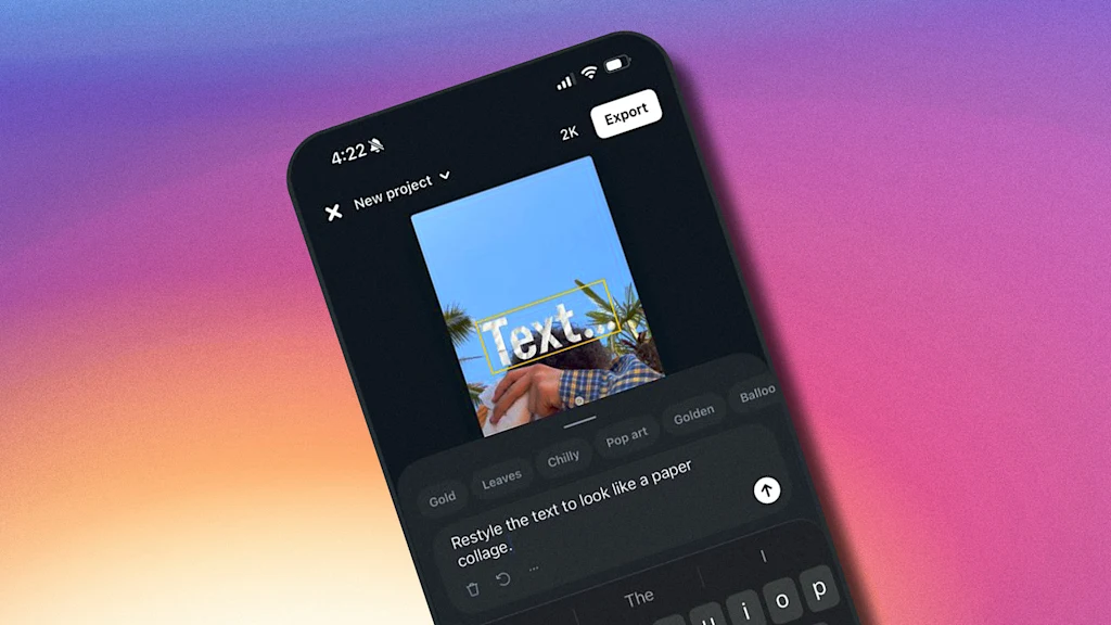
2 months agoHow to get unlimited AI video and image generations in Adobe Firefly for free
If you love using Firefly, Adobe's AI-first content creation suite, the company is opening up access for the next six weeks to give you even more generations. Through March 16, users can create unlimited images and videos up to 2K resolution via Firefly's website, Firefly Boards, and the free Firefly app for iOS and Android (more on each below). Firefly lets users generate royalty-free music, sound effects, and try features like the viral Generative Fill.
Artificial intelligence
fromFast Company
1 month agoMattel has a new custom font, and it's full of playful hidden details
Mattel operates dozens of brands under its corporate umbrella, each with their own visual identity and brand voice. But, until now, Mattel has never had its own proprietary typeface for its overarching brand, instead opting to license multiple existing fonts on a global scale—an endeavor that was not only expensive, but also came at the cost of visual consistency across Mattel's many product lines.
Typography

fromItsnicethat
2 months agoPedro Stolf is making sci-fi queer again with futuristic graphic design
Massaranduba, the small agricultural town in the south of Brazil that Pedro grew up in is far from sci-fi, but this graphic designer's imagination takes him some place else. From posters, illustration, magazine layouts and typefaces (such as pieces that focus on sci-fi author Ursula K. Le Guin 's fictional Kesh alphabet), Pedro works digitally with a focus on textures and grit, using dithers and fractals to build upon visual world's textures. His projects are "mood-centred", which begin by assembling references from all over to refine feelings that are conjured up by consuming films, fashion, music and other visual forms.
Design

Graphic design
fromItsnicethat
2 months agoThe magic behind Louis Garella's design process is "a constant back-and-forth between digital and print"
Louis Garella merges visual arts, graphic design, and spatial design into tactile, multimedia work blending digital and print techniques to produce expressive, research-rooted visual languages.
fromI Love Typography Ltd
1 month agoSteven Heller's Font of the Month: Cattivo - I Love Typography Ltd
Infused with history, the slab cannot help but suggest the old West's frontier clichés, for such ephemera as classic wanted posters, political broadsides, cautionary warning signs, and more generic commercial applications. Cattivo is a brand-new 18-font family that, when used in any weight and size, cuts through nostalgic predictability and provides a welcome alternative to such popular Egyptian-style slab serifs as Stymie and Memphis.
Typography
fromItsnicethat
1 month agoThe experimental graphic design work of Ward Goes sits at the intersection of type and materiality
A graphic designer that isn't limited to working in 2D, Ward Goes has been working in aluminium of late. His recent solo show in Rotterdam, Literally Anything, was full of things that moved beyond the screen or printed page, including some wonderful metal signage and archival storage. The exhibition at Alley Space was the result of the designer's decision to pursue more tactical investigations alongside his commissioned work at the start of 2025.
Typography
fromI Love Typography Ltd
4 months agoILT Blog Redesign - I Love Typography Ltd
The main problem with the existing homepage was that, besides the most recent posts, other content, once it aged and 'fell off' the front page, was then difficult to discover. The new design makes more use of available screen 'real estate', is visually much richer, and reorganizes 18 years of posts, so that even older long-forgotten posts are more easily found.
fromI Love Typography Ltd
5 months agoSteven Heller's Font of the Month: OTC Textura - I Love Typography Ltd
Blackletter typefaces elicit many contradictory emotions depending, of course, on the context in which they are used and the manner in which they are composed. Sometimes they bark commands - STOP or BEWARE. Other times they are comforting in an ecclesiastical way - Christmas and Easter greetings. During World War II Blackletter was menacing for those in occupied lands who read it as exclusionary - as in FORBIDDEN or DANGER; others accepted it as patriotic
Typography
Typography
fromItsnicethat
2 months agoDeborah Khodanovich's font honours the most trivialised form of communication - gossip
Gossip functions as a communal craft that preserves values, enables care, evades censorship, and challenges patriarchal control through informal, untraceable conversation and typographic reclamation.
[ Load more ]