UX design
fromMedium
37 minutes agoYou're not supposed to get it right
Design challenges for UX writers can be intimidating due to the pressure of making quick, impactful decisions and the emphasis on visual elements.
Santa Cruz de Tenerife is one of the most idyllic cities in the Canary Islands. At its heart stands the jewel - the Auditorio. It's a place where talent from both worlds, New and Old, comes together. A theatre, opera, dance, and music heaven.
Google recently released a new AI model, Gemini 3.1, that demonstrates great results in UI and web design tasks. I've already tested this model for web design tasks and in this article, I want to experiment with Gemini 3.1 and generate UI for a mobile application.
Instructions I created. Instructions I am continuing to hone - instructions that required me to study my own old essays, identifying what I do when I write. The sentence rhythms. The way I move between timescales. The zooming in and out from concept to detail. The instructions tell Claude how I would like ideas composed. I pull together concepts and experiences from my lived expertise to formulate a point of view - in this case, on this new AI technology.
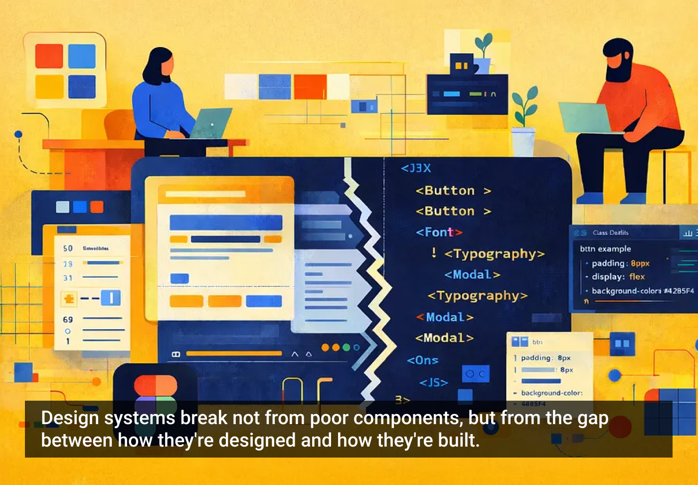
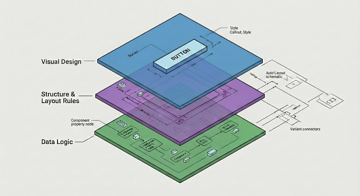
Design tokens are all your design decisions, that define a design system's aesthetic properties, everything from colors and font sizes to spacing units and border radii. They are the modern evolution of hard-coded values. They are stored in a central, platform-agnostic repository, establishing a single source of truth for your entire digital product suite. This central management allows teams to consume the exact same design values across all platforms (web, native apps, documentation).
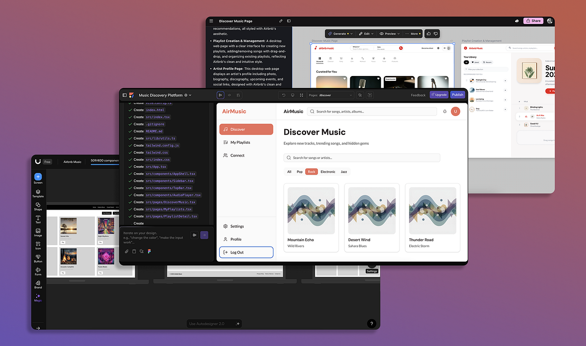
One skill separates good designers: the ability to clearly articulate their intention. No matter what tool you use, whether it's a traditional UI design tool like Figma or Sketch or AI tools like Figma Make, your ability to explain what you want to see accounts for 50% of your design success. The other 50% comes from your hard and soft skills. When it comes to AI-powered design, your ability to write decent prompts will have a direct impact on the quality of your design. In this guide, I want to share some specific tips and tricks that you can use for Figma Make to maximize the output.
Teams often use customer and user interchangeably until it breaks alignment. Here's how separating the two clarifies research, prioritization, and messaging across B2C, B2B, and B2B2C products.
Something's been slowly shifting in the design zeitgeist. I've been watching my feed on X and the vibe has changed. More and more, I see designers sharing finished experiments or prototypes they coded themselves, rather than static Figma files. Moving from working on a canvas to talking to an LLM. The conversation isn't "here's a design I made" anymore... it's "here's something I shipped this afternoon."
In Andor, I got chills when Mon Mothma warns the senate of a chilling truth: When we let noise, conformity, or fear dominate, we lose sight of what matters. We risk allowing the loudest voices, often the safest, the most predictable, to drown out individuality, identity, and truth. To me, this line... This line echoes a growing tension I feel in content design.