#letterpress-printing
#letterpress-printing
[ follow ]
#typography #design #craftsmanship #creative-process #graphic-design #type-design #printmaking #typeface-design
Arts
fromHyperallergic
2 weeks agoMay You Live in Interesting Times - The IFPDA Print Fair Asks, Do Bad Times Really Inspire Great Art?
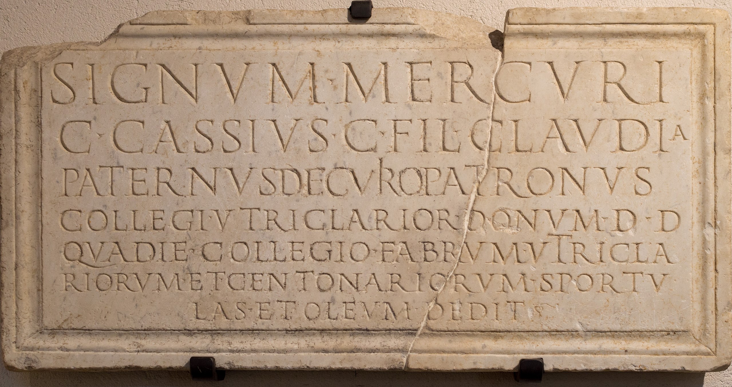
The IFPDA Print Fair showcases 80 exhibitors displaying printmaking from Goya to Walker, demonstrating how artists use prints as therapy and critique during times of crisis and political turmoil.
Arts
fromColossal
3 weeks agoLongevity and Obsoletion Impress Upon Alexander Endrullat's Intaglio Prints
Artist Alexander Endrullat creates prints by running discarded laptops through a century-old printing press, revealing device destruction and internal structures while commenting on consumption and planned obsolescence.
fromArtnet News
3 weeks agoOops, Typo! A New Exhibition Embraces 500 Years of Printed Mistakes
What we found was that errata sheets were not only spaces for corrections but also sites of humor, legal maneuvering, and reinterpretation. With this exhibition, we wanted to share ways in which even small corrections can reshape meaning and authority.
Arts
Typography
fromItsnicethat
3 weeks agoEleanor Yang merges the synthetic and organic to make typography you can touch
Synthetic Nature presents three typefaces—DNA, Mesh, and Data—that metaphorically represent life through biological, network, and computational structures, exploring how biology, computation, and culture merge.
Books
fromianVisits
1 month agoNew exhibition explores how early printing developed into readable books
William Caxton revolutionized English book printing in the late 15th century, transforming books from elite luxury items into affordable, widely accessible products through rapid technological advancement.
Arts
fromColossal
3 weeks agoYou'll Need a Magnifying Glass to Read Some of the World's Smallest Books at the V&A
Queen Mary's Dolls' House at Windsor Castle contains nearly 600 miniature books designed by leading craftspeople, representing a remarkable collection of scaled literary works from the early 20th century.
Graphic design
fromItsnicethat
3 weeks agoLydia Chodosh probes design rules through archiving and cataloguing
Designer Lydia Chodosh interrogates how knowledge is acquired and transmitted through language, archival systems, and interdisciplinary design practice informed by literature, publishing, and visual communication.
Typography
fromYanko Design - Modern Industrial Design News
3 weeks ago8 Best Japanese Stationery Finds So Clever You'll Question Why the Rest of the World Even Bothers - Yanko Design
Japanese stationery applies precision engineering to everyday writing tools, solving friction points others accept as normal through thoughtful design details.
Graphic design
fromItsnicethat
4 weeks agoThe illustrations of Sebastian Curi are all about learning analogue tools (flaws and freckles included)
Sebastian integrates multiple artistic mediums—acrylic painting, colored pencils, and relief printing—while using digital tools primarily for documentation and learning the foundational principles behind each technique.
fromLondon On The Inside
1 month agoLearn How to Make Journal Covers With Moleskine
You'll get a pre-made faux leather cover to decorate and personalise with a range of buttons, charms, stamps and fabric pieces. You'll learn to experiment with collage and layering techniques and combine different types of embellishments to add texture, colour and personality to your journal.
Arts
Typography
fromColossal
1 month ago'Lettres Decoratives' Is a Celebration of Fin de Siecle Sign Painters' Vibrant Letterforms
French sign painters from the 19th and early 20th centuries created decorative alphabets that evolved from simple forms into bold, eye-catching lettering styles documented in lithograph portfolios.
Typography
fromI Love Typography Ltd
1 month agoSteven Heller's Font of the Month: Curve Display - I Love Typography Ltd
Curve Display is a Didone-inspired display font that balances classical elegance with experimental, abstract letterforms, making it distinctive yet accessible for contemporary graphic design.

fromYanko Design - Modern Industrial Design News
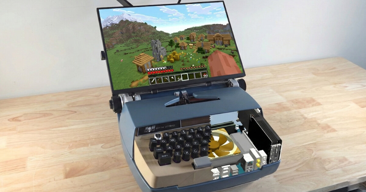
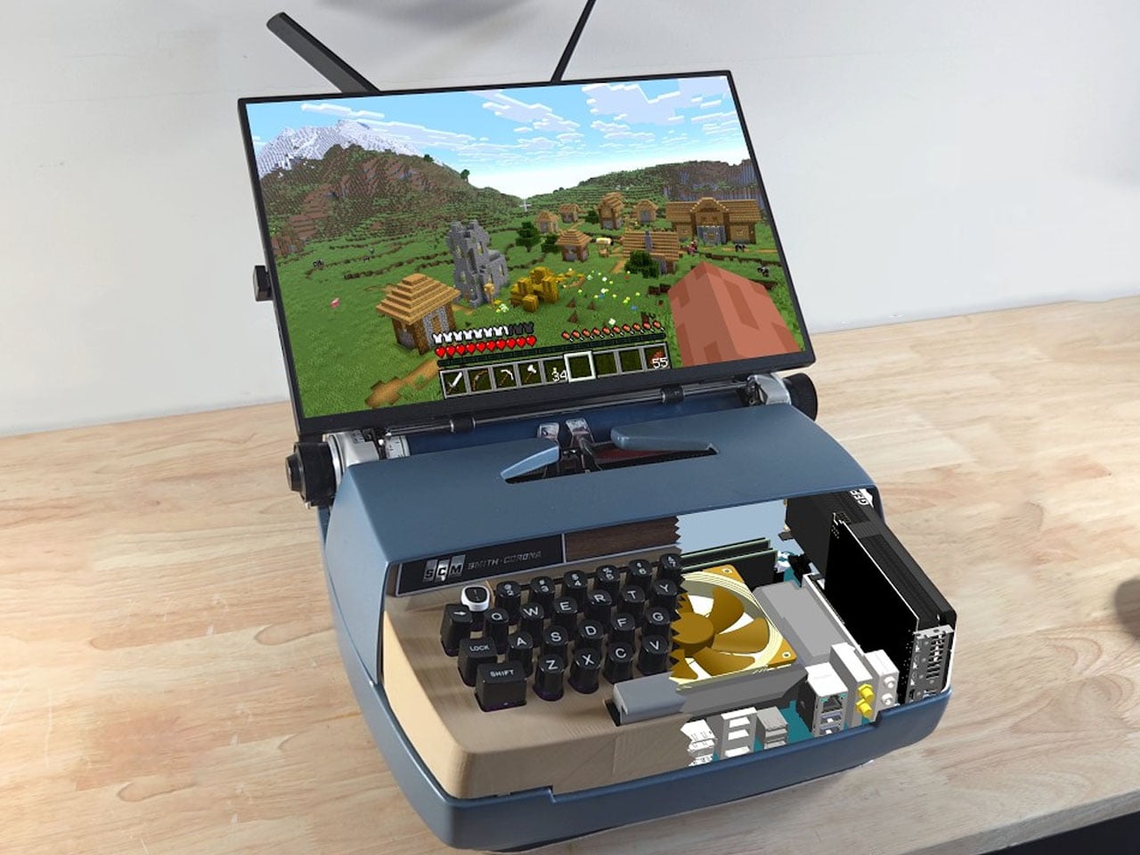
2 months agoZerowriter Ink Is an Open-Source E-Paper Typewriter Built for Writers - Yanko Design
Trying to write on a laptop means fighting a machine that is also a notification box, streaming portal, and social feed. Distraction-free apps help, but they still live inside the same browser-and-tab chaos, surrounded by everything else your computer knows how to do. Some writers just want a device that only knows how to produce plain text and does not care about anything else happening in the world.
Gadgets
fromFast Company
1 month agoThe Getty's new logo is a blocky tribute to its vast collections
We needed a visual identity that was uniquely Getty and distinct enough to unify how we show up globally. This system gives Getty one clear, ownable expression in support of the work we do around the world.
Typography
fromThe Art Newspaper - International art news and events
1 month agoPace Prints will open printmaking studio and gallery in Los Angeles
Since launching its first project in 1968—a sculptural embossed silkscreen book by the multimedia artist Lucas Samaras—Pace Prints has worked with artists to expand the formal and technical possibilities of printmaking. In the ensuing decades, the publisher has supported projects by artists like Louise Nevelson and John Chamberlain that blur distinctions between print, collage, sculpture and painting, often emphasising scale and material experimentation.
Arts
fromHyperallergic
1 month agoArtists Thinking Out Loud: The IFPDA Returns to the Park Avenue Armory this April
"Drawings at the IFPDA make great sense," said Jenny Gibbs, Executive Director of the IFPDA and IFPDA Foundation. "Museums group them together because both media represent graphic thinking and the transmutation of ideas through line and pressure."
Arts
Books
fromOregon ArtsWatch * Arts & Culture News
1 month agoBuckman Journal: 'We print stuff that we enjoy' * Oregon ArtsWatch
Buckman Journal is a Portland-based independent press and biannual anthology publisher fostering a collaborative, inclusive local literary community from a hybrid neighborhood workspace.
fromFast Company
2 months agoHermes' hand-illustrated website is the ultimate luxury
If you visit the Hermès website in search of a scarf or a handbag, you'll be greeted by a collection of whimsical sea creatures swimming across the screen. To navigate to the watch section, you'll click on an image of a watch flanked by an eel. To locate shoes, you'll click on a loafer with a pelican sitting inside it as if it were riding a boat.
Fashion & style

fromItsnicethat
2 months ago"A scrapbook of raw, layered process, inspiration and practice": Dixon Baxi on their 500-page manifesto for making
"We started by asking everyone to collect images regularly. Just spontaneous snapshots as we went. Of everything. Sketches, screens, notes, half thoughts, moments in motion. Over time it became this huge grab bag of elements," Simon says.
Books
fromItsnicethat
1 month agoThis archival book celebrates the bygone eras of the humble crisp packet
Helping people to reconnect with old memories, viewers are transported to their local corner shop, school playgrounds and childhood cupboards. "I think this project has struck a chord because there's a particular interest in hand drawn designs of the past in the current age of AI where human effort is at an all-time low. Now the first thought is 'I'll get AI to do that', rather than commissioning an illustrator," says Chris.
Graphic design
Writing
fromFortune
2 months agoGen Zers and millennials go analog with letter writing, typewriter clubs and calligraphy to take a break from screen time | Fortune
People are reconnecting through retro tactile communication methods like letter writing, calligraphy and typewriting to slow down, reduce digital use, and build meaningful relationships.
fromItsnicethat
2 months agoPedro Stolf is making sci-fi queer again with futuristic graphic design
Massaranduba, the small agricultural town in the south of Brazil that Pedro grew up in is far from sci-fi, but this graphic designer's imagination takes him some place else. From posters, illustration, magazine layouts and typefaces (such as pieces that focus on sci-fi author Ursula K. Le Guin 's fictional Kesh alphabet), Pedro works digitally with a focus on textures and grit, using dithers and fractals to build upon visual world's textures. His projects are "mood-centred", which begin by assembling references from all over to refine feelings that are conjured up by consuming films, fashion, music and other visual forms.
Design
Graphic design
fromItsnicethat
2 months agoThe magic behind Louis Garella's design process is "a constant back-and-forth between digital and print"
Louis Garella merges visual arts, graphic design, and spatial design into tactile, multimedia work blending digital and print techniques to produce expressive, research-rooted visual languages.
fromCraftBeer.com
2 months agoInk & Drink: Uncovering the Historical Bonds of Tattoos and Fermentation Across Cultures
Tattoos and fermentation rarely appear in the same conversation, yet across the world, they share a quiet kinship. Both are practices of transformation, crafts that reshape raw material over time through care and relationships to the land, the spiritual, and the community. Tattooing inscribes identity and ancestry onto skin, while fermentation preserves, nourishes, and binds communities through shared taste and ritual. Both create change, brewing something more than themselves through embodied knowledge passed between generations.
Arts
fromColossal
2 months agoRep Your Love for Independent Arts Publishing
Our new line of Colossal merchandise is finally hitting the (digital) shelves in the Colossal Shop. We're big fans of repping publications that inspire us, and we're excited to finally offer our own goods to this special community of readers. Hats and mugs are now available, and all proceeds directly support our ongoing commitment to make art accessible to everyone. You can also receive a mug by joining us with an annual Patron of the Arts membership.
Arts
fromItsnicethat
2 months agoFaber Editions' type-led cover design system is breathing new life into old books
Those he saw as "most successful" had a "bold typographic and/or illustrative treatment" which in turn "countered the dominance" of the branding strip that ran down the side. "This realisation led me to define some rules for the designs of the individual covers that tried to ensure that the covers would never feel overwhelmed by the branding system," says Pete. "The core rule was that the Editions would essentially be typographic covers, or typographically-led covers in terms of the hierarchy between type and image."
Typography
fromI Love Typography Ltd
2 months agoSteven Heller's Font of the Month: Cattivo - I Love Typography Ltd
Infused with history, the slab cannot help but suggest the old West's frontier clichés, for such ephemera as classic wanted posters, political broadsides, cautionary warning signs, and more generic commercial applications. Cattivo is a brand-new 18-font family that, when used in any weight and size, cuts through nostalgic predictability and provides a welcome alternative to such popular Egyptian-style slab serifs as Stymie and Memphis.
Typography
fromItsnicethat
1 month agoThe experimental graphic design work of Ward Goes sits at the intersection of type and materiality
A graphic designer that isn't limited to working in 2D, Ward Goes has been working in aluminium of late. His recent solo show in Rotterdam, Literally Anything, was full of things that moved beyond the screen or printed page, including some wonderful metal signage and archival storage. The exhibition at Alley Space was the result of the designer's decision to pursue more tactical investigations alongside his commissioned work at the start of 2025.
Typography
fromI Love Typography Ltd
4 months agoILT Blog Redesign - I Love Typography Ltd
The main problem with the existing homepage was that, besides the most recent posts, other content, once it aged and 'fell off' the front page, was then difficult to discover. The new design makes more use of available screen 'real estate', is visually much richer, and reorganizes 18 years of posts, so that even older long-forgotten posts are more easily found.
fromI Love Typography Ltd
5 months agoSteven Heller's Font of the Month: OTC Textura - I Love Typography Ltd
Blackletter typefaces elicit many contradictory emotions depending, of course, on the context in which they are used and the manner in which they are composed. Sometimes they bark commands - STOP or BEWARE. Other times they are comforting in an ecclesiastical way - Christmas and Easter greetings. During World War II Blackletter was menacing for those in occupied lands who read it as exclusionary - as in FORBIDDEN or DANGER; others accepted it as patriotic
Typography
fromItsnicethat
2 months agoHow sign painting underpins Sean Thomas' approach to bespoke branding projects
If you're based in London, you've probably walked past one of Sean Thomas' meticulously hand-painted designs. Whether that was grabbing a sandwich at Dom's Subs, dining in at Forza Win (an Italian restaurant in Peckham that the designer has shaped the visual identity of over the last three years), or picking up a copy of Hoxton Mini Press' new book on Britain's best bakeries at your local bookshop.
Typography
[ Load more ]