UX design
fromMedium
9 hours agoThe invisible layer of UX most designers ignore
Designers must prioritize screen reader compatibility to ensure accessibility, as users rely on spoken content rather than visual elements.
Santa Cruz de Tenerife is one of the most idyllic cities in the Canary Islands. At its heart stands the jewel - the Auditorio. It's a place where talent from both worlds, New and Old, comes together. A theatre, opera, dance, and music heaven.
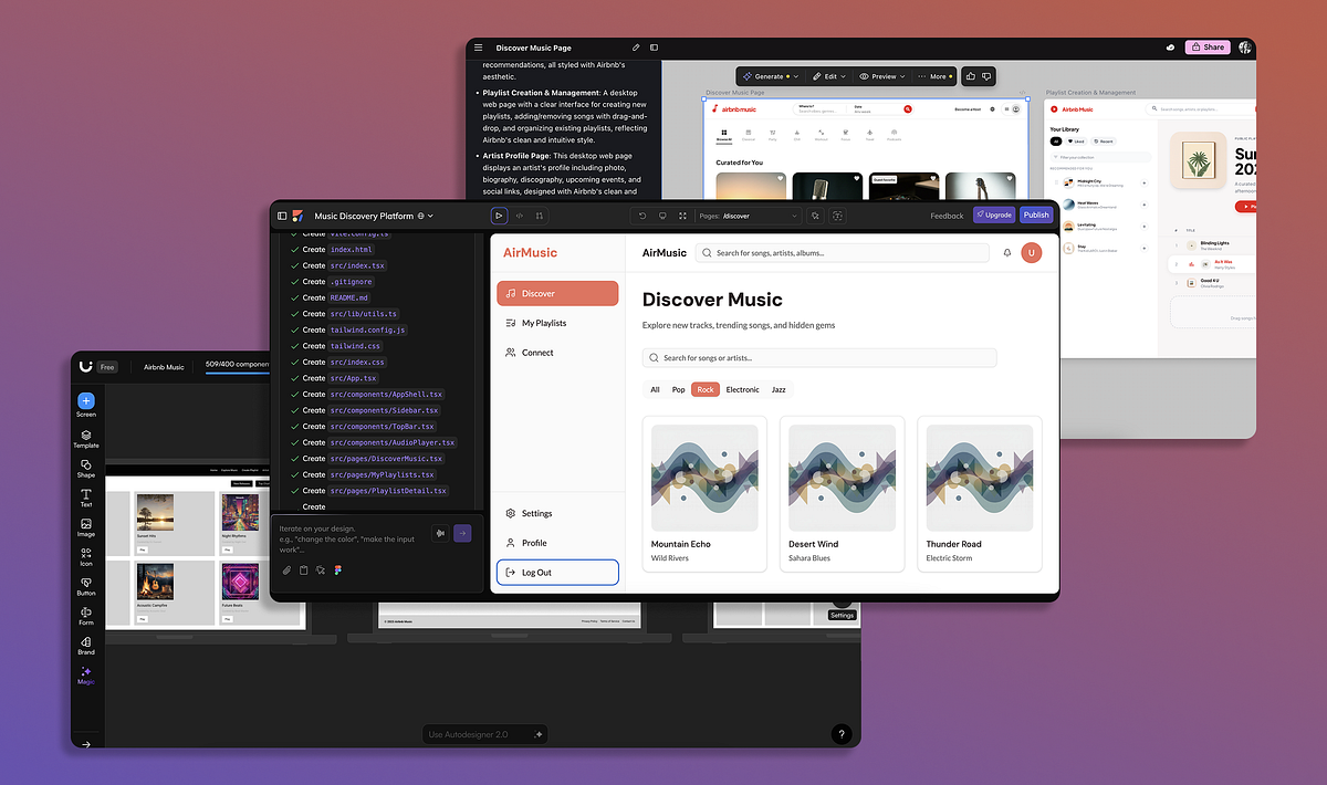
Google recently released a new AI model, Gemini 3.1, that demonstrates great results in UI and web design tasks. I've already tested this model for web design tasks and in this article, I want to experiment with Gemini 3.1 and generate UI for a mobile application.
In Andor, I got chills when Mon Mothma warns the senate of a chilling truth: When we let noise, conformity, or fear dominate, we lose sight of what matters. We risk allowing the loudest voices, often the safest, the most predictable, to drown out individuality, identity, and truth. To me, this line... This line echoes a growing tension I feel in content design.
Teams often use customer and user interchangeably until it breaks alignment. Here's how separating the two clarifies research, prioritization, and messaging across B2C, B2B, and B2B2C products.
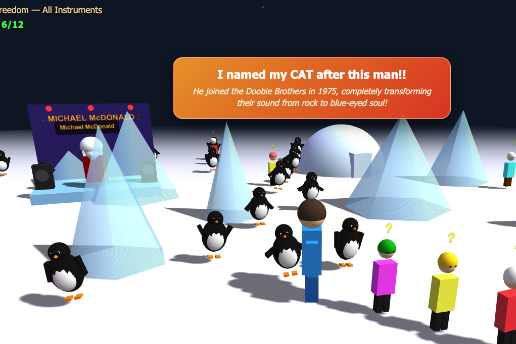
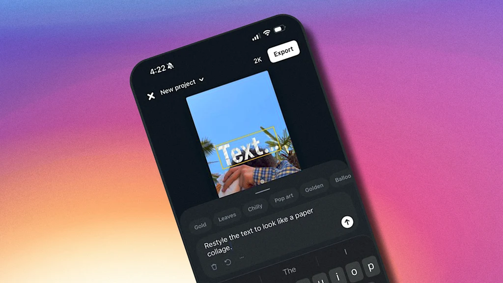
Nano Banana Pro (Gemini 3 image model) is particularly strong for UI design because of its 99% text accuracy, its ability to understand spatial layout, and its support for high-resolution 4K output. In this article, I want to share my 5 favorite cases of using this model for UI design tasks. ( Quick note: I won't dive into a critique of the output generated by AI in this article, letting you decide whether you like it or not)
One predictable pain point with contrast-color() is that it only returns black and white named colors. From a design systems perspective, that's not ideal because you want your colors. You want your harmonious brand and the colors you and your team spent thousands of man hours in meetings deciding on. Those colors. In fact, an earlier version of Safari had color-contrast() (confusing I know, naming is hard) which allowed you to pass in a list of best candidates to choose from. I beleive that proposal got mired in standards discussions, color contrast algorithms, and competing proposals; and contrast-color() is what survived which got simplified down to a binary result.
Linear-style UIs look simple, but the theming system has to do real work. Here's how to meet WCAG 2.2 contrast requirements across light, dark, and high-contrast modes whether you're using a UI library or rolling your own tokens.