#pantone-colors

[ follow ]
#design-principles
UX design
fromSmashing Magazine
4 days ago

A Practical Guide To Design Principles - Smashing Magazine

Design principles align teams, inform decisions, and embody organizational values, serving as essential tools in the design process.
UX design
fromSmashing Magazine
4 days ago

A Practical Guide To Design Principles - Smashing Magazine

Design principles align teams, inform decisions, and embody organizational values, serving as essential tools in the design process.
UX design
fromSmashing Magazine
4 days ago

A Practical Guide To Design Principles - Smashing Magazine

Design principles align teams, inform decisions, and embody organizational values, serving as essential tools in the design process.
UX design
fromSmashing Magazine
4 days ago

A Practical Guide To Design Principles - Smashing Magazine

Design principles align teams, inform decisions, and embody organizational values, serving as essential tools in the design process.
Tech industry
fromFortune
3 days ago

Do creators still need Adobe in the AI era? | Fortune

Adobe must adapt to AI rapidly while maintaining trust with enterprise customers reliant on its software.
Web development
fromCSS-Tricks
4 days ago

What's !important #8: Light/Dark Favicons, @mixin, object-view-box, and More | CSS-Tricks

SVG favicons can adapt to color schemes, and @mixin is progressing in CSS.
fromMail Online
5 days ago

What colour are the dots in this optical illusion?

'In this paper a novel optical illusion is described in which purple structures (dots) are perceived as purple at the point of fixation, while the surrounding structures (dots) of the same purple colour are perceived toward a blue hue.'
Science
Relationships
fromSlate Magazine
4 days ago

My Car, House, and Dog Are All the Same Color. My Husband Thinks It Sends the Wrong Message.

Color choices in home and car do not inherently convey racial messages or beliefs.
Typography
fromMass-driver
5 days ago

MD UI: a Typeface for Interfacing

Typefaces deserve careful design and consideration, balancing quality and legibility while acknowledging the challenges of achieving perfection.
#color-perception
Games
fromMail Online
1 week ago

How good is YOUR colour perception? Take deceptively difficult test

The 'What's My JND?' test challenges players to identify the smallest color difference between two shades.
Science
fromwww.scientificamerican.com
1 week ago

What color is this dot? New illusion demonstrates weird vision quirk

Color perception can change based on focus, as demonstrated by an illusion with purple dots appearing more purple when directly looked at.
Graphic design
fromItsnicethat
4 days ago

Oilinwater approaches branding like an investigator, to build visual systems from rigorous research

Oilinwater, founded by Matthieu Gorissen, is a creative studio in Brussels specializing in branding and graphic design, with a unique backstory and projects.
Remodel
fromApartment Therapy
2 weeks ago

I Tried the "8-Inch Rule" - and It's Going to Make Everything Look More Expensive

The '8-inch' paint rule significantly improves the accuracy of paint color selection by using larger swatches for better representation in different lighting.
UX design
fromDesign Systems Report 2026
3 days ago

Design Systems Report 2026 - brought to you by zeroheight

Design systems are transitioning from inflated expectations to disillusionment, facing challenges in adoption, resource allocation, and executive support.
Design
fromdesignboom | architecture & design magazine
2 weeks ago

a rich palette of saturated hues meet industrial precision in mara's renewed digital identity

Mara enters 2026 as a global interior design protagonist, expanding from office and hospitality into residential markets while strengthening its digital identity and sustainability commitment.
Fashion & style
fromwww.theguardian.com
2 weeks ago

Jess Cartner-Morley on fashion: primary colours are back, but styling them isn't child's play

Primary colors are returning to fashion runways after a decade of muted tones, but wearing them requires strategic styling to avoid appearing basic or unsophisticated.
Web development
fromUna
3 weeks ago

una.im | contrast-color() beyond black & white

contrast-color() returns black or white for maximum contrast, but workarounds using color-mix() and style queries enable custom color palette selection while maintaining accessibility.
Web design
fromZDNET
2 weeks ago

Why your biggest tech upgrade this year is a splash of color

Tech companies increasingly release hardware in vibrant colors like pink, reflecting consumer demand for personalized, colorful technology that serves as personal extensions rather than neutral devices.
Graphic design
fromMedium
1 week ago

For Craft Sake: On the laws and principles behind good design

Craft is experiencing a resurgence in product design, emphasizing fundamental skills amidst the rise of generative AI and industry confusion.
Fashion & style
fromwww.theguardian.com
3 weeks ago

My mother's best advice: wear bold, bright colours

Wearing colors that match your internal mood fosters self-awareness and authentic self-expression rather than conforming to external expectations.
Remodel
fromApartment Therapy
3 weeks ago

Pro Painters Say Homeowners Regret This Paint Trend the Most

Dark accent walls are the most common paint color regret among homeowners because they clash with evolving personal style and make spaces feel cramped.
Cars
fromLmnt
1 month ago

Have We Forgotten How to Design?

Waymo's partnership with DoorDash to manually close passenger car doors reveals a fundamental oversight in autonomous vehicle design, despite the availability of proven automated door technology.
Web design
fromMedium
3 weeks ago

The color statistic that's been wrong for 80 years

The commonly cited claim that humans can see between 1 million and 10 million colors lacks scientific precision and requires examination of what actually constitutes a distinguishable color.
Fashion & style
fromThe Globe and Mail
4 weeks ago

The business of colour analysis is booming - again

Colour analysis, a 1980s trend, has resurged as a popular service where experts determine whether individuals are Winter, Spring, Summer, or Fall based on skin, hair, and eye undertones to guide personal styling choices.
Design
fromBusiness Matters
1 month ago

Why You Should Beautify Slides for Better Engagement and Clarity

Effective presentations prioritize clear messages with supporting visuals over decorative design, making content memorable and engaging while reducing cognitive load for audiences.
Graphic design
fromMedium
3 weeks ago

Design is not just how it works. Design is how it wins.

AI commodifies work, shifting design's mandate from functional excellence to competitive winning as the primary objective.
#interior-design
Web design
fromRaymondcamden
1 month ago

Dyanimically Adjusting Image Text for Contrast

Color Thief library now includes TypeScript definitions and new contrast detection features, including a textColor property that automatically suggests optimal text color for readability over images.
UX design
fromFast Company
1 month ago

5 design principles to feel fully alive

Meaningful life emerges through daily design practices and experiences rather than one-time discovery, with aliveness and human potential exceeding what any single lifetime can express.
#desktop-wallpapers
Web design
fromAol
1 month ago

The Best Paint Colors for Your Home Office

Strategic paint colors enhance home office productivity by promoting focus, reducing stress, and creating either energizing or calming work environments.
fromSubstack
1 month ago

20 Design Reference Platforms Beyond Dribbble

Static images don't show motion. You can't inspect real product structure. You don't see how interfaces evolve over time. You rarely understand what actually works in production. So I decided to go deep. I reviewed every major design reference platform I could find - not just the popular ones - and analyzed how they actually help in real-world work. The conclusion?
Mobile UX
#color-psychology
fromForbes
2 months ago
Marketing

The ROI Of Color: How Pantone Predicts Global Trends And Shapes Consumer Behavior

fromForbes
2 months ago
Marketing

The ROI Of Color: How Pantone Predicts Global Trends And Shapes Consumer Behavior

#home-office
fromColossal
1 month ago

With 200+ Artworks, 'Rainbow Dreams' Revels in the Vast Creativity of the Color Spectrum

From Do Ho Suh's ethereal architecture to Kimsooja's irridescent mirrors to Lauren Halsey's fringed tapestry, a new book from Monacelli celebrates a broad spectrum of light and color. Rainbow Dreams features more than 200 installations, sculptures, paintings, photographs, and more that revel in the possibilities of pigment. Bound in a smooth gradient that extends to the pages' edges, this vivid survey is a celebratory, playful object in itself.
Books
Marketing
fromWE AND THE COLOR
1 month ago

Branding Mistakes in Design: 10 Critical Errors & Strategic Fixes

Strategic brand architecture, not visual aesthetics alone, determines client perception and business outcomes for design professionals.
fromFast Company
2 months ago

Pantone just made a color matching starter kit for only $99

Its newest, though, is a single-fan book with more than 600 spot colors, and it's priced at just $99. Pantone for beginners. Pantone on Thursday announced its Pantone Capsule: Signature Edition. Housed in a collectible, cylindrical case that wouldn't look out of place in a Sephora, the guide is a sort of Pantone 101 that come on coated and uncoated paper stock with colors selected from across more than 60 years of Pantone history.
Design
fromItsnicethat
1 month ago

The experimental graphic design work of Ward Goes sits at the intersection of type and materiality

A graphic designer that isn't limited to working in 2D, Ward Goes has been working in aluminium of late. His recent solo show in Rotterdam, Literally Anything, was full of things that moved beyond the screen or printed page, including some wonderful metal signage and archival storage. The exhibition at Alley Space was the result of the designer's decision to pursue more tactical investigations alongside his commissioned work at the start of 2025.
Typography
fromApartment Therapy
1 month ago

The Surprising Reason Butter Yellow Isn't Trending Anymore (Hint: It's Economic)

Architect-turned-interior designer Anh Ly, founder and CEO of Mim Concept, explains why the color surged in the first place: "Butter yellow had a magic moment because it felt optimistic and comforting, especially during a time when people were craving warmth at home." Now, that emotional pull is also what's working against it. "It fell short on resale since it's a very emotion-specific color. Buyers tend to see it as personal rather than neutral, which makes it harder for them to imagine themselves in the space," Ly adds.
Renovation
Marketing
fromCreative Review
2 months ago

How to talk about a rebrand

Rebrands are judged quickly but require months of behind-the-scenes work and careful explanation amid loud, often reductive online commentary.
fromCSS-Tricks
1 month ago

Approximating contrast-color() With Other CSS Features | CSS-Tricks

There have been a few drafts of a specification function for this functionality, most recently, contrast-color() (formerly color-contrast()) in the CSS Color Module Level 5 draft. But with Safari and Firefox being the only browsers that have implemented it so far, the final version of this functionality is likely still a ways off. There has been a lot of functionality added to CSS in the meantime; enough that I wanted to see whether we could implement it in a cross-browser friendly way today. Here's what I have: color: oklch(from <your color> round(1.21 - L) 0 0);
Web development
fromdaverupert.com
2 months ago

Using your design system colors with contrast-color()

One predictable pain point with contrast-color() is that it only returns black and white named colors. From a design systems perspective, that's not ideal because you want your colors. You want your harmonious brand and the colors you and your team spent thousands of man hours in meetings deciding on. Those colors. In fact, an earlier version of Safari had color-contrast() (confusing I know, naming is hard) which allowed you to pass in a list of best candidates to choose from. I beleive that proposal got mired in standards discussions, color contrast algorithms, and competing proposals; and contrast-color() is what survived which got simplified down to a binary result.
fromI Love Typography Ltd
3 months ago

10 Must-have Typefaces for 2026 - I Love Typography Ltd

Our Must-Have Fonts for 2025 list was our most popular ever, but our must-have fonts for 2026 list aims to set the bar even higher. Finding the best typefaces among thousands can be pretty daunting! So, to make things easier, we've curated a list of outstanding must-have typefaces for the coming year. The ten font families in the list share something important in common - an explicitly human touch, not machine-made or prompt-produced, but born from human minds and crafted by human hands.
#pantone
fromwww.aljazeera.com
2 months ago

Why is Cloud Dancer' the colour of the year?

We examine the online debate ignited by Pantone's Colour of the Year, Cloud Dancer. This episode dives into the discussion prompted by Pantone, unpacking the uneasy relationship between colour and fascism. From hardline efforts to regulate colour in public life to the ways vibrancy and maximalism reassert themselves, we explore how colour becomes a quiet form of resistance across art, fashion, film, and design.
Design
Remodel
fromApartment Therapy
2 months ago

The "Color Echo" Method Is How Designers Make Bold Paint Look Amazing

Repeat a chosen color in at least two visible locations to make bold hues feel cohesive, curated, and prevent them from appearing random or tacky.
Renovation
fromApartment Therapy
2 months ago

Move Over Millennial Pink - Designers Say "Frosted" Hues Are 2026's It Colors

Frosted icy pastels provide soft, uplifting color that evokes dawn and fresh starts while avoiding commitment to fully saturated tones.
UX design
fromEntrepreneur
1 month ago

The Design Mistake That's Quietly Weakening Your Brand

Good design reduces cognitive load, signals clarity and reliability, aligns organizational thinking, accelerates decisions, and prevents user confusion to improve conversion, retention, and adoption.
fromBusiness Insider
2 months ago

Color drenching is all the rage, but interior designers say it's easy to make these 5 mistakes

"color drenching" is when people paint an entire room one hue, including the ceiling, wainscotting, and any trim.
Remodel
fromApartment Therapy
1 month ago

We Asked 6 Designers the Best Color for Small Bathrooms: These Shades Won

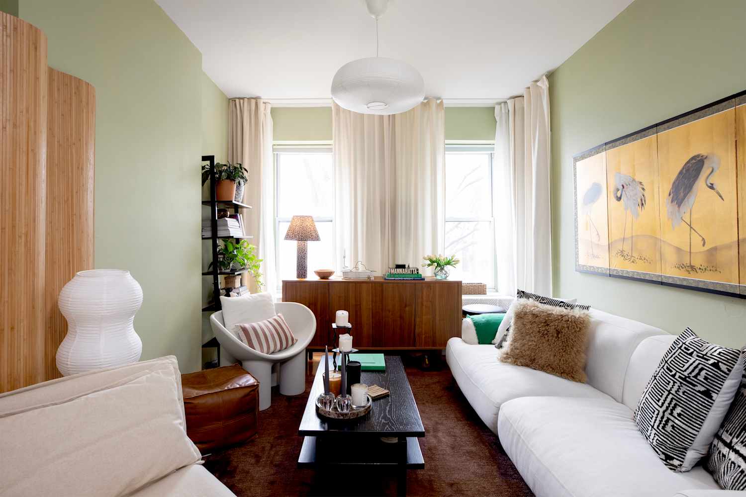
Making a small bathroom both beautiful and functional is a tall task; after all, they're often short on light, floor space and lofty ceilings. Creating a design for tiny bathrooms should focus on using every inch of space effectively - but since each of these spaces (no matter how small!) have walls, a paint color may be your most important choice.
Design
Design
fromArchDaily
2 months ago

2026 Color of the Year Selections Highlight Tonal Depth and Spatial Calm

2026 color trends favor nuanced, layered, midtone neutrals and muted greens/blues that emphasize material authenticity, tonal balance, and understated spatial calm.
#css
UX design
fromFreebie Supply
2 months ago

CSS Calendar Ideas - Freebie Supply

User-friendly, well-designed web and app calendars integrated via front-end frameworks and CSS are essential for accurate date selection and strong UX across devices.
fromDesign Milk
1 month ago

The 2026 Color Collection by 3form is Rooted in History

The 2026 Color Collection from 3form highlights hues that have anchored design across generations and cultures for thousands of years. The brand's sixth grouping is a departure from last year's palette, which emphasized the emotional power of select shades. With the guiding theme "Color that Connects," the new line features tones that are celebrated by communities around the globe. Inspiration for the palette came from exploring natural pigments used to make certain colors, and how they were found in various locales over time.
Remodel
Design
fromBusiness Matters
1 month ago

How Visual Consistency Creates Brand Trust in Digital Spaces

Consistent visual presentation across digital platforms builds recognition, reduces cognitive load, and increases perceived trustworthiness and professionalism, supporting long-term business growth.
UX design
fromMedium
2 months ago

Design tokens with confidence

Aligning design tokens with the W3C standard creates a platform-agnostic single source of truth that propagates updates consistently and reduces maintenance and visual regressions.
Design
fromApartment Therapy
2 months ago

Marigold Trend 2026: Why Designers Love This Bold Earthy Color

Marigold, a saturated orange-yellow, is emerging as a dominant 2026 interior color trend that brings warmth, energy, and versatile cozy appeal.
Design
fromBusiness Insider
2 months ago

6 home-decor choices that will never go out of style, according to interior designers

Invest in high-quality, durable decor like wool rugs and meaningful personal pieces to create a timeless, individual, and long-lasting home aesthetic.
[ Load more ]