UX design
fromMedium
4 hours agoYou're not supposed to get it right
Design challenges for UX writers can be intimidating due to the pressure of making quick, impactful decisions and the emphasis on visual elements.
Santa Cruz de Tenerife is one of the most idyllic cities in the Canary Islands. At its heart stands the jewel - the Auditorio. It's a place where talent from both worlds, New and Old, comes together. A theatre, opera, dance, and music heaven.
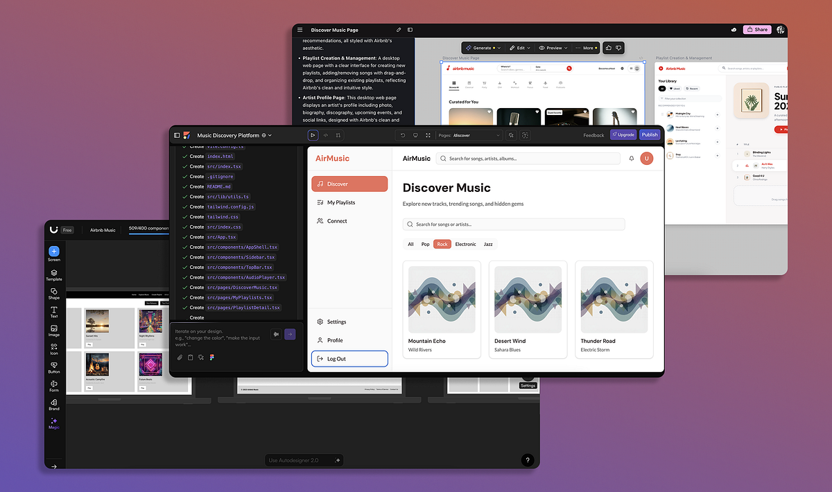
Google recently released a new AI model, Gemini 3.1, that demonstrates great results in UI and web design tasks. I've already tested this model for web design tasks and in this article, I want to experiment with Gemini 3.1 and generate UI for a mobile application.
Instructions I created. Instructions I am continuing to hone - instructions that required me to study my own old essays, identifying what I do when I write. The sentence rhythms. The way I move between timescales. The zooming in and out from concept to detail. The instructions tell Claude how I would like ideas composed. I pull together concepts and experiences from my lived expertise to formulate a point of view - in this case, on this new AI technology.
Here's the sad truth about sports score apps: Most of them aren't all that interested in actually telling you the score. After all, where's the money in providing straightforward information like that? The modern sports score app has to do more. It must bombard you with banner ads and betting odds, implore you to create an account and opt into notifications, sell you some tickets, and show some videos to keep engagement up. The scores themselves are an afterthought.
Performance is a critical factor in user engagement, where even minor delays in loading can deter users. A clean and simple user interface also contributes significantly to user retention.
Today we are at the cusp of revolutions in artificial intelligence, autonomous vehicles, renewable energy, and biotechnology. Each brings extraordinary promise, but each introduces more complexity, more interdependence, and more latent pathways to failure. This elevates prudence to be critical. Good design recognizes what cannot be foreseen. It acknowledges the limits of prediction and control. It builds not merely for performance, but for recovery.
In Andor, I got chills when Mon Mothma warns the senate of a chilling truth: When we let noise, conformity, or fear dominate, we lose sight of what matters. We risk allowing the loudest voices, often the safest, the most predictable, to drown out individuality, identity, and truth. To me, this line... This line echoes a growing tension I feel in content design.
I am a UX designer, which means I can no longer use the internet without noticing everything that is wrong with it. This article is about UX patterns that are frustrating, widely adopted, and somehow still treated as acceptable at massive scale. If you have never noticed them, consider yourself lucky. Once you do, they become impossible to unsee. Your tolerance for digital nonsense may permanently decrease after reading this article. That is your warning!
Teams often use customer and user interchangeably until it breaks alignment. Here's how separating the two clarifies research, prioritization, and messaging across B2C, B2B, and B2B2C products.
Minimal doesn't always mean usable. This comparison shows how Linear-style UI keeps contrast, affordances, and structure intact, unlike brutalism's extremes or neumorphism's low-clarity depth effects. Daniel Schwarz Feb 5, 2026 2 min read Linear-style UIs look simple, but the theming system has to do real work. Here's how to meet WCAG 2.2 contrast requirements across light, dark, and high-contrast modes whether you're using a UI library