UX design
fromSmashing Magazine
3 days agoA Practical Guide To Design Principles - Smashing Magazine
Design principles align teams, inform decisions, and embody organizational values, serving as essential tools in the design process.
Elisava's Master's in Graphic Design is ingrained with societal, cultural and critical contributions to the creative industry, going beyond its aesthetic output while fostering self-awareness in creatives.
Designed by artists and designers from across the globe, each wallpaper comes in a variety of screen resolutions and can be downloaded for free. A huge thank-you to everyone who shared their designs with us - this post wouldn't be possible without your kind support!
Static images don't show motion. You can't inspect real product structure. You don't see how interfaces evolve over time. You rarely understand what actually works in production. So I decided to go deep. I reviewed every major design reference platform I could find - not just the popular ones - and analyzed how they actually help in real-world work. The conclusion?
WordPress plays a key role in this strategy. The content management system (CMS) and its ecosystem are vehicles for helping us adapt to what's next. Features like connecting to third-party APIs and implementing artificial intelligence (AI) come to mind. It all adds up to an exciting time to build websites and related applications. However, it's possible to go a little too far with technology - particularly when it comes to customer service.
Helping people to reconnect with old memories, viewers are transported to their local corner shop, school playgrounds and childhood cupboards. "I think this project has struck a chord because there's a particular interest in hand drawn designs of the past in the current age of AI where human effort is at an all-time low. Now the first thought is 'I'll get AI to do that', rather than commissioning an illustrator," says Chris.
Design tokens are all your design decisions, that define a design system's aesthetic properties, everything from colors and font sizes to spacing units and border radii. They are the modern evolution of hard-coded values. They are stored in a central, platform-agnostic repository, establishing a single source of truth for your entire digital product suite. This central management allows teams to consume the exact same design values across all platforms (web, native apps, documentation).
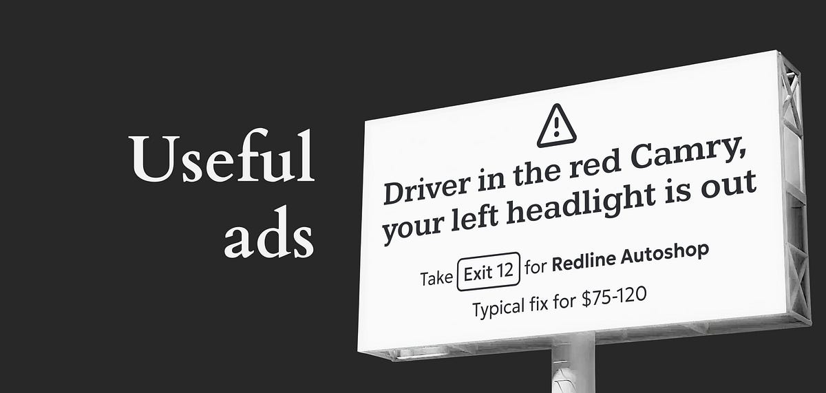
We might be exposed to more ads and commercials today than ever before in human history, but the idea of advertising itself is certainly not a new concept. According to Instapage, the first signs of advertisements actually appeared in ancient Egyptian steel carvings from 2000 BC. Meanwhile, the first printed ad was published in 1472, when William Caxton decided to advertise a book by posting flyers on church doors in England.
In Andor, I got chills when Mon Mothma warns the senate of a chilling truth: When we let noise, conformity, or fear dominate, we lose sight of what matters. We risk allowing the loudest voices, often the safest, the most predictable, to drown out individuality, identity, and truth. To me, this line... This line echoes a growing tension I feel in content design.
Infused with history, the slab cannot help but suggest the old West's frontier clichés, for such ephemera as classic wanted posters, political broadsides, cautionary warning signs, and more generic commercial applications. Cattivo is a brand-new 18-font family that, when used in any weight and size, cuts through nostalgic predictability and provides a welcome alternative to such popular Egyptian-style slab serifs as Stymie and Memphis.
The main problem with the existing homepage was that, besides the most recent posts, other content, once it aged and 'fell off' the front page, was then difficult to discover. The new design makes more use of available screen 'real estate', is visually much richer, and reorganizes 18 years of posts, so that even older long-forgotten posts are more easily found.
Blackletter typefaces elicit many contradictory emotions depending, of course, on the context in which they are used and the manner in which they are composed. Sometimes they bark commands - STOP or BEWARE. Other times they are comforting in an ecclesiastical way - Christmas and Easter greetings. During World War II Blackletter was menacing for those in occupied lands who read it as exclusionary - as in FORBIDDEN or DANGER; others accepted it as patriotic
Monotypes logotype couldn't just exist in one static state - "ideas of diversity, adaptability, and boundary-pushing were central to the creation of the variable logo from the start," says Daniel. Collaborative workshops, sketching sessions and exchanges with Chantelle's global chief creative officer, Renaud Cambuzat, and head of design, Natalia Kotkowska, cemented into the idea for a shapeshifter logo capable of morphing its look through different weights and shapes.