#teal-translucent-aesthetic
#teal-translucent-aesthetic
[ follow ]

fromMail Online
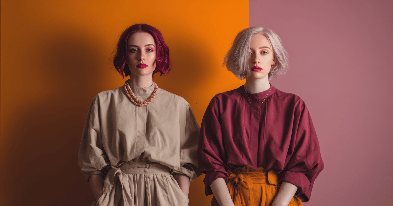
5 days agoWhat colour are the dots in this optical illusion?
'In this paper a novel optical illusion is described in which purple structures (dots) are perceived as purple at the point of fixation, while the surrounding structures (dots) of the same purple colour are perceived toward a blue hue.'
Science

fromArchitectural Digest
2 days agoI'm Done Sourcing So Much Online. Here's Why
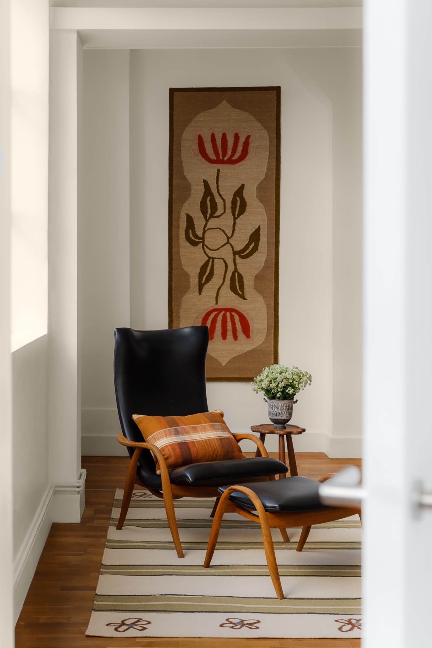
The convenience of sourcing online is fraught with more pitfalls than most of us want to admit. Try finding adequate photos of a vintage piece's condition-close-ups of the fabric, video of damaged areas, any images of a piece's rear or underside!
UX design


Design
fromYanko Design - Modern Industrial Design News
6 days ago5 Scandinavian Product Trends That Will Make Your Home Instantly Feel Like Hygge - Yanko Design
Scandinavian design emphasizes clean lines, natural materials, and functionality, creating a harmonious balance between aesthetics and practicality.

Design
fromdesignboom | architecture & design magazine
2 weeks agoa rich palette of saturated hues meet industrial precision in mara's renewed digital identity
Mara enters 2026 as a global interior design protagonist, expanding from office and hospitality into residential markets while strengthening its digital identity and sustainability commitment.
Renovation
fromRedfin | Real Estate Tips for Home Buying, Selling & More
3 weeks ago5 Reasons Why Lighting Design Matters More Than You Think in Home Interiors
Thoughtful lighting design enhances home comfort, style, and well-being by supporting circadian rhythms and transforming how spaces feel and function.
Renovation
fromApartment Therapy
4 weeks agoThis Bedroom Makeover Created the Dreamiest Blue Retreat
A renter transformed her bedroom by embracing a cohesive blue color scheme, painting walls, closet doors, and radiator in Farrow & Ball's Inchyra Blue, then adding matching dark blue curtains and tapestry for a cozy, intentional aesthetic.
Remodel
fromApartment Therapy
3 weeks agoThis Dark, Dated Dining Room Got a Bold Makeover - Thanks to One Unexpected Color
A dining room transformation uses warm white walls, terracotta ceiling trim, wood molding, and a modern pendant light to create a bright, warm, and practical space suitable for a young family.
fromdaverupert.com
2 months agoUsing your design system colors with contrast-color()
One predictable pain point with contrast-color() is that it only returns black and white named colors. From a design systems perspective, that's not ideal because you want your colors. You want your harmonious brand and the colors you and your team spent thousands of man hours in meetings deciding on. Those colors. In fact, an earlier version of Safari had color-contrast() (confusing I know, naming is hard) which allowed you to pass in a list of best candidates to choose from. I beleive that proposal got mired in standards discussions, color contrast algorithms, and competing proposals; and contrast-color() is what survived which got simplified down to a binary result.
fromBustle
2 months agoYou're Making Your Home Look Cheap If You Aren't Doing These Simple Things
When clutter piles up, closets burst at the seams, and cords snake all over your desk, your home can quickly look - and feel - messy. Or maybe it's your tired furniture or flooring that needs some TLC. The good news is that you don't have to spend a ton on a renovation to fix these problem; in fact, sometimes the solution is surprisingly easy and affordable. And that's where this list comes in, with simple upgrades that help you take control of the things that are making your home look cheap.
Renovation
fromApartment Therapy
1 month agoThe Surprising Reason Butter Yellow Isn't Trending Anymore (Hint: It's Economic)
Architect-turned-interior designer Anh Ly, founder and CEO of Mim Concept, explains why the color surged in the first place: "Butter yellow had a magic moment because it felt optimistic and comforting, especially during a time when people were craving warmth at home." Now, that emotional pull is also what's working against it. "It fell short on resale since it's a very emotion-specific color. Buyers tend to see it as personal rather than neutral, which makes it harder for them to imagine themselves in the space," Ly adds.
Renovation
fromApartment Therapy
1 month agoWe Asked 6 Designers the Best Color for Small Bathrooms: These Shades Won
Making a small bathroom both beautiful and functional is a tall task; after all, they're often short on light, floor space and lofty ceilings. Creating a design for tiny bathrooms should focus on using every inch of space effectively - but since each of these spaces (no matter how small!) have walls, a paint color may be your most important choice.
Design
fromRemodelista
1 month agoFuture Tense: 11 Design Trends for 2026 - Remodelista
Pigments Instead of Paints Experimental Art Spaces Return to Analog Above: You've probably seen the recent surge of "analog bags": tote bags filled with knitting, small sewing projects, crossword puzzles (the kind on paper), and other things to fill in-between moments. Call it analog, call it DIY, but making things-and antidotes to doomscrolling-is a move we can get behind in 2026. Photograph via artist Kate Kilmurray from Natural, Hand-Woven DIY Potholders Will Have You Revisiting a Childhood Craft.
Renovation
fromApartment Therapy
2 months agoThe Free Design Tool That'll Transform Your Home (It'll Look 10x Better!)
Apartment Therapy's January Cure is a free 20-day program that'll help you refresh your home for the year ahead. Sign up here and get all assignments delivered to your inbox. Go to the Mood Board homepage. Browse our collections of photos, products, and colors, or upload your own images. Tap on an image to add it to your canvas. Move, resize, crop, and layer using our smart tools. You can even add text.
Design
fromYanko Design - Modern Industrial Design News
2 months ago5 Interior Design Trends That Just Made Minimalism Obsolete in 2026 - Yanko Design
Architects today see the home as more than just a place to live. It is now understood as a space that affects how people think, feel, and live each day. By 2026, the field has clearly moved away from cold, uniform minimalism. Instead, design choices such as color, shape, and proportion are made with clear intent, helping to create spaces that support everyday life.
Design
fromDesign Milk
1 month agoThe 2026 Color Collection by 3form is Rooted in History
The 2026 Color Collection from 3form highlights hues that have anchored design across generations and cultures for thousands of years. The brand's sixth grouping is a departure from last year's palette, which emphasized the emotional power of select shades. With the guiding theme "Color that Connects," the new line features tones that are celebrated by communities around the globe. Inspiration for the palette came from exploring natural pigments used to make certain colors, and how they were found in various locales over time.
Remodel
fromTasting Table
2 months ago15 Neutral Paint Colors For Your Kitchen That Are On-Trend Yet Timeless - Tasting Table
The kitchen is the heart of most homes, a warm space where families gather and guests inevitably gravitate during a party. That's why keeping a comfortable and beautiful kitchen is often at the forefront when folks decide to update or remodel their homes. Among the many things to consider when taking on a kitchen remodel is what colors and style to choose.
Remodel
[ Load more ]