UX design
fromSmashing Magazine
3 days agoA Practical Guide To Design Principles - Smashing Magazine
Design principles align teams, inform decisions, and embody organizational values, serving as essential tools in the design process.
Elisava's Master's in Graphic Design is ingrained with societal, cultural and critical contributions to the creative industry, going beyond its aesthetic output while fostering self-awareness in creatives.
Static images don't show motion. You can't inspect real product structure. You don't see how interfaces evolve over time. You rarely understand what actually works in production. So I decided to go deep. I reviewed every major design reference platform I could find - not just the popular ones - and analyzed how they actually help in real-world work. The conclusion?
We've both fought against needless promotional content before and lamented that frontier AI platforms are falling into the same pattern. As designers and users, we've learned that "free" usually means putting up with interruptive, slightly creepy ads that feel more like a tax than a benefit - a frustration tax that now colors how we approach free‑tier services and now AI tools.
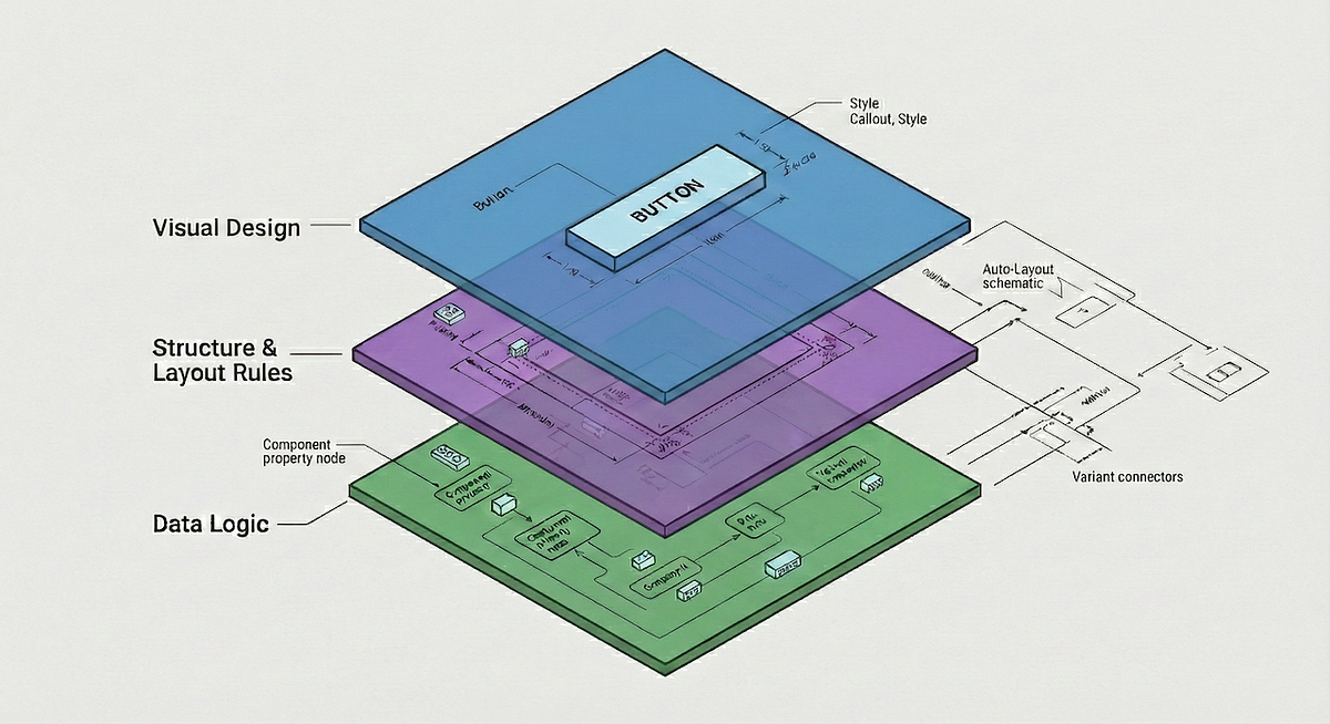
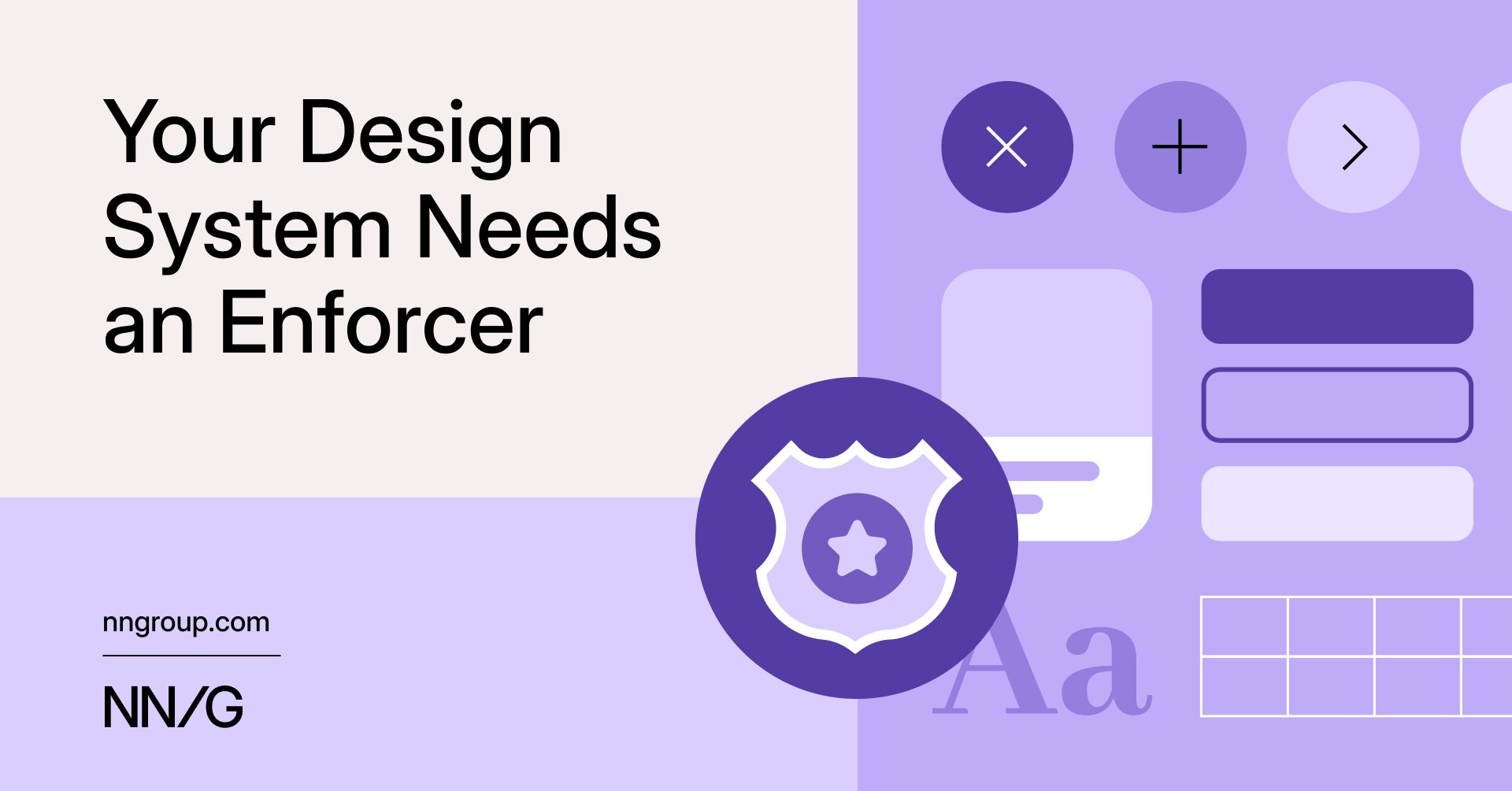
Design tokens are all your design decisions, that define a design system's aesthetic properties, everything from colors and font sizes to spacing units and border radii. They are the modern evolution of hard-coded values. They are stored in a central, platform-agnostic repository, establishing a single source of truth for your entire digital product suite. This central management allows teams to consume the exact same design values across all platforms (web, native apps, documentation).
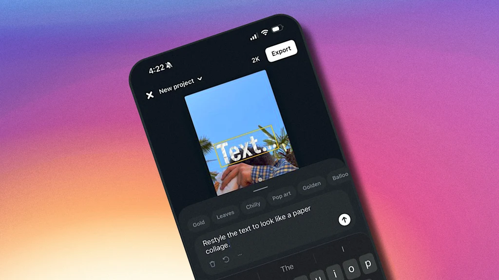
One skill separates good designers: the ability to clearly articulate their intention. No matter what tool you use, whether it's a traditional UI design tool like Figma or Sketch or AI tools like Figma Make, your ability to explain what you want to see accounts for 50% of your design success. The other 50% comes from your hard and soft skills. When it comes to AI-powered design, your ability to write decent prompts will have a direct impact on the quality of your design. In this guide, I want to share some specific tips and tricks that you can use for Figma Make to maximize the output.
In Andor, I got chills when Mon Mothma warns the senate of a chilling truth: When we let noise, conformity, or fear dominate, we lose sight of what matters. We risk allowing the loudest voices, often the safest, the most predictable, to drown out individuality, identity, and truth. To me, this line... This line echoes a growing tension I feel in content design.
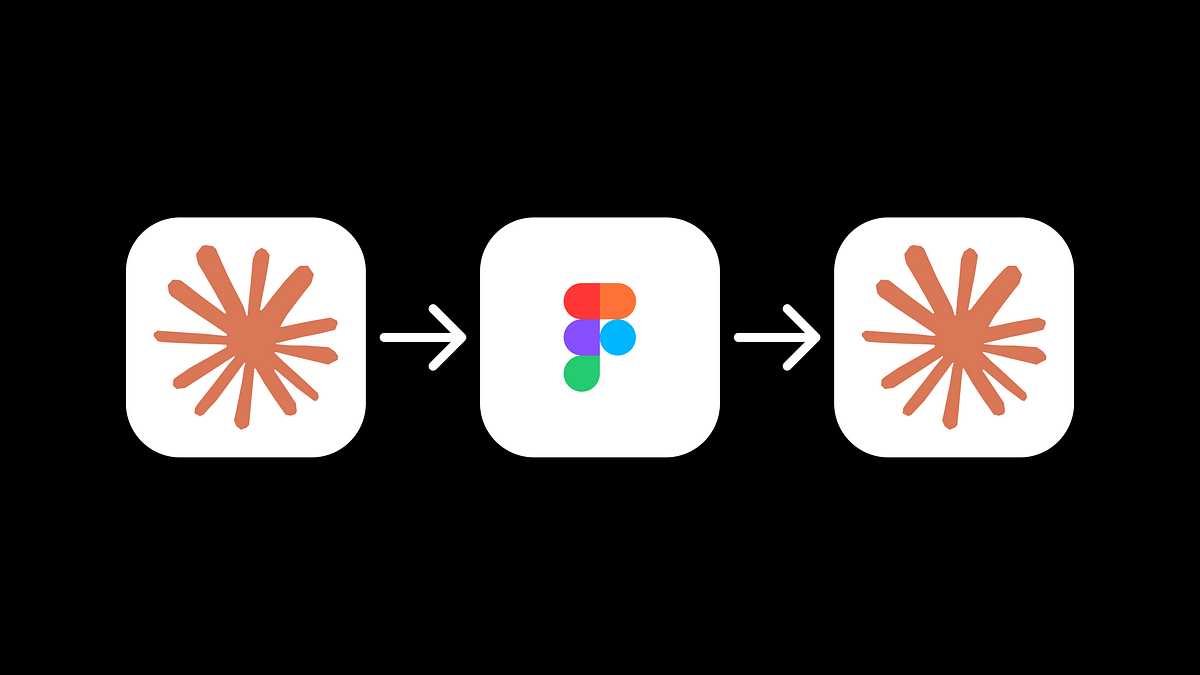
Something's been slowly shifting in the design zeitgeist. I've been watching my feed on X and the vibe has changed. More and more, I see designers sharing finished experiments or prototypes they coded themselves, rather than static Figma files. Moving from working on a canvas to talking to an LLM. The conversation isn't "here's a design I made" anymore... it's "here's something I shipped this afternoon."
To be honest, for many years, I was mostly reacting. Life was happening to me, rather than me shaping the life that I was living. I was making progress reactively and I was looking out for all kinds of opportunities. It was easy and quite straightforward - I was floating and jumping between projects and calls and making things work as I was going along. Years ago, my wonderful wife introduced one little annual ritual which changed that dynamic entirely.
One predictable pain point with contrast-color() is that it only returns black and white named colors. From a design systems perspective, that's not ideal because you want your colors. You want your harmonious brand and the colors you and your team spent thousands of man hours in meetings deciding on. Those colors. In fact, an earlier version of Safari had color-contrast() (confusing I know, naming is hard) which allowed you to pass in a list of best candidates to choose from. I beleive that proposal got mired in standards discussions, color contrast algorithms, and competing proposals; and contrast-color() is what survived which got simplified down to a binary result.
Teams often use customer and user interchangeably until it breaks alignment. Here's how separating the two clarifies research, prioritization, and messaging across B2C, B2B, and B2B2C products.