#blue
#blue
[ follow ]
#interior-design #color-psychology #aesthetics #photography #design #consumer-behavior #art #paint-color
Design
fromdesignboom | architecture & design magazine
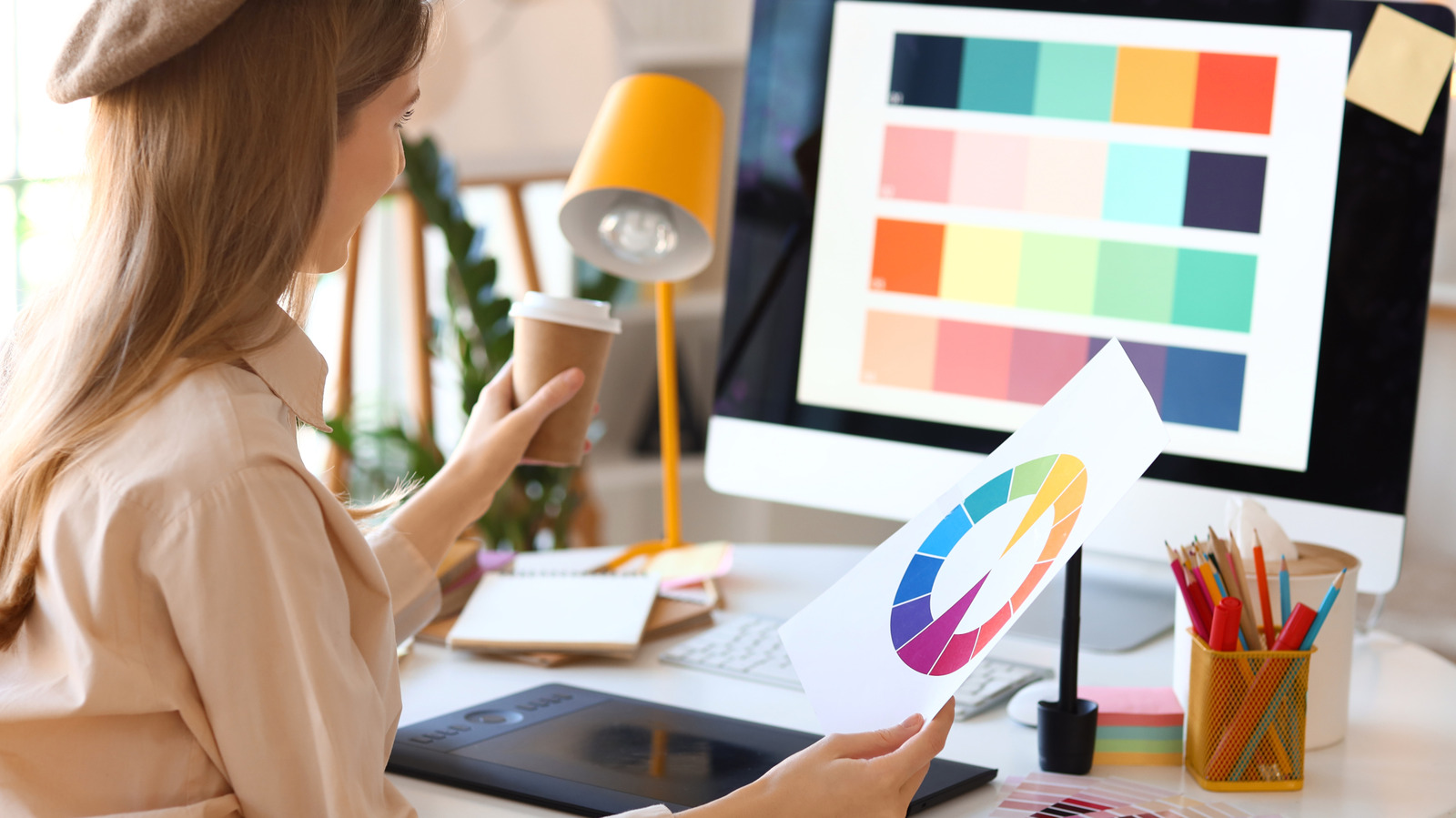
2 weeks agoa rich palette of saturated hues meet industrial precision in mara's renewed digital identity
Mara enters 2026 as a global interior design protagonist, expanding from office and hospitality into residential markets while strengthening its digital identity and sustainability commitment.
Renovation
fromApartment Therapy
3 weeks agoThis Bedroom Makeover Created the Dreamiest Blue Retreat
A renter transformed her bedroom by embracing a cohesive blue color scheme, painting walls, closet doors, and radiator in Farrow & Ball's Inchyra Blue, then adding matching dark blue curtains and tapestry for a cozy, intentional aesthetic.
Fashion & style
fromThe Globe and Mail
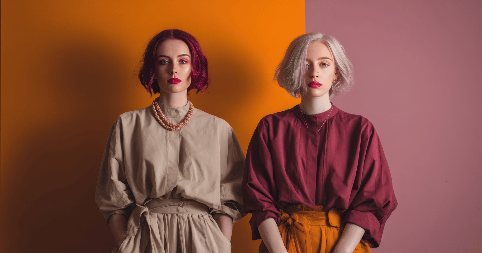
4 weeks agoThe business of colour analysis is booming - again
Colour analysis, a 1980s trend, has resurged as a popular service where experts determine whether individuals are Winter, Spring, Summer, or Fall based on skin, hair, and eye undertones to guide personal styling choices.
fromPsychology Today
1 month agoThe Health Benefits of Looking at Beauty
Beauty, it turns out, is capable of launching not just an armada of ships, but a cascade of the same feel-good chemicals you get from being in love, eating chocolate, exercising, and having orgasms- dopamine, endorphins, serotonin, oxytocin. It also lowers stress, blood pressure, and heart rate.
Miscellaneous
Photography
fromdesignyoutrust.com
1 month agoStunning Digital Storytelling Landscapes By Prismofpixels, Turning Quiet Streets And Town Squares Into Cinematic Moments Of Color And Light
A curated collection of diverse visual works spanning paintings, photography, design, and historical images across eras, genres, and artistic mediums.

fromwww.arogyayogaschool.com
2 months agoBlue Aura Meaning: Shades of Blue and Their Significance
Blue aura is among of the most well-known and important aura colors. Auras are subtle energy field that surrounds living things. They show a person's physical, mental, and spiritual state. People link blue auras to peace and truth. They also relate to communication and spiritual understanding. It is a signification of a person who has calm and reflective appearance that emits calm and peace. The challenges could include overthinking, emotional sensitiveness or withdrawal when stressed.
Yoga
fromColossal
1 month agoWith 200+ Artworks, 'Rainbow Dreams' Revels in the Vast Creativity of the Color Spectrum
From Do Ho Suh's ethereal architecture to Kimsooja's irridescent mirrors to Lauren Halsey's fringed tapestry, a new book from Monacelli celebrates a broad spectrum of light and color. Rainbow Dreams features more than 200 installations, sculptures, paintings, photographs, and more that revel in the possibilities of pigment. Bound in a smooth gradient that extends to the pages' edges, this vivid survey is a celebratory, playful object in itself.
Books
frommissionlocal.org
1 month agoPick a color
Help grow our newsroom, joining the 3,250 readers who support us by giving below. See all snaps here. To contribute, send in a headline and a snap to info@missionlocal.com. Because of you, Mission Local reached and surpassed our $300,000 year-end fundraising goal. All we can say is thank you. Thank you for choosing to invest in a local newsroom rooted in San Francisco's communities one that listens first and reports deeply.
San Francisco
Arts
fromdesignyoutrust.com
2 months agoAn Artist Layers Synthwave Glow And Surreal Dreams Into Vibrant Worlds Celebrating Neurodivergence And Inner Strength
A diverse collection of provocative visual works spans dark mortality themes, surreal and conceptual art, tattoos, social commentary, and popular-culture phenomena like NFTs.
Mindfulness
fromSilicon Canals
2 months agoPeople who prefer a tidy, simple home over a flashy one usually have these 7 traits of quiet sophistication - Silicon Canals
Quiet sophistication prioritizes minimal, purposeful spaces and experiences over possessions, creating calm, freedom, and lasting fulfillment.
fromInsideHook
2 months agoOn Your Next Date, Go Color Hunting
"Me and my girlfriend went on color hunting in Berlin this weekend," user Erikas Mališauskas shared on X. "We picked two random colors and had to make a 3×3 photo grid featuring that color. I got yellow, she got blue, here's the result." Commenters rallied together in agreement, saying how good of an idea this is.
Relationships
fromRaymondcamden
1 month agoBuilding a Bluesky Sentiment Dashboard with Alpine and Chrome AI
Good morning, programs! Today I'm sharing yet another example of Chrome's on-device AI features, this time to demonstrate a "Bluesky Sentiment Dashboard". In other words, a tool that lets you enter terms and then get a report on the average sentiment for posts using that word. I actually did this before (and yes, I forgot until about a minute ago) last year using Transformers.js: Building a Bluesky AI Sentiment Analysis Dashboard.
Web development
fromMedium
1 month agoEmotional design: let's design for silence
I'm looking at the stage but I don't know what I saw, even though the message is somehow clear. I was invited into the self-reflection of a lost person, projected inward through an attempt to escape from the simulation of post-apocalyptic reality, which through our human stupidity has turned our world into a capitalist grey wasteland, where you can survive if you accept that you don't exist, and there is only us.
UX design
fromApartment Therapy
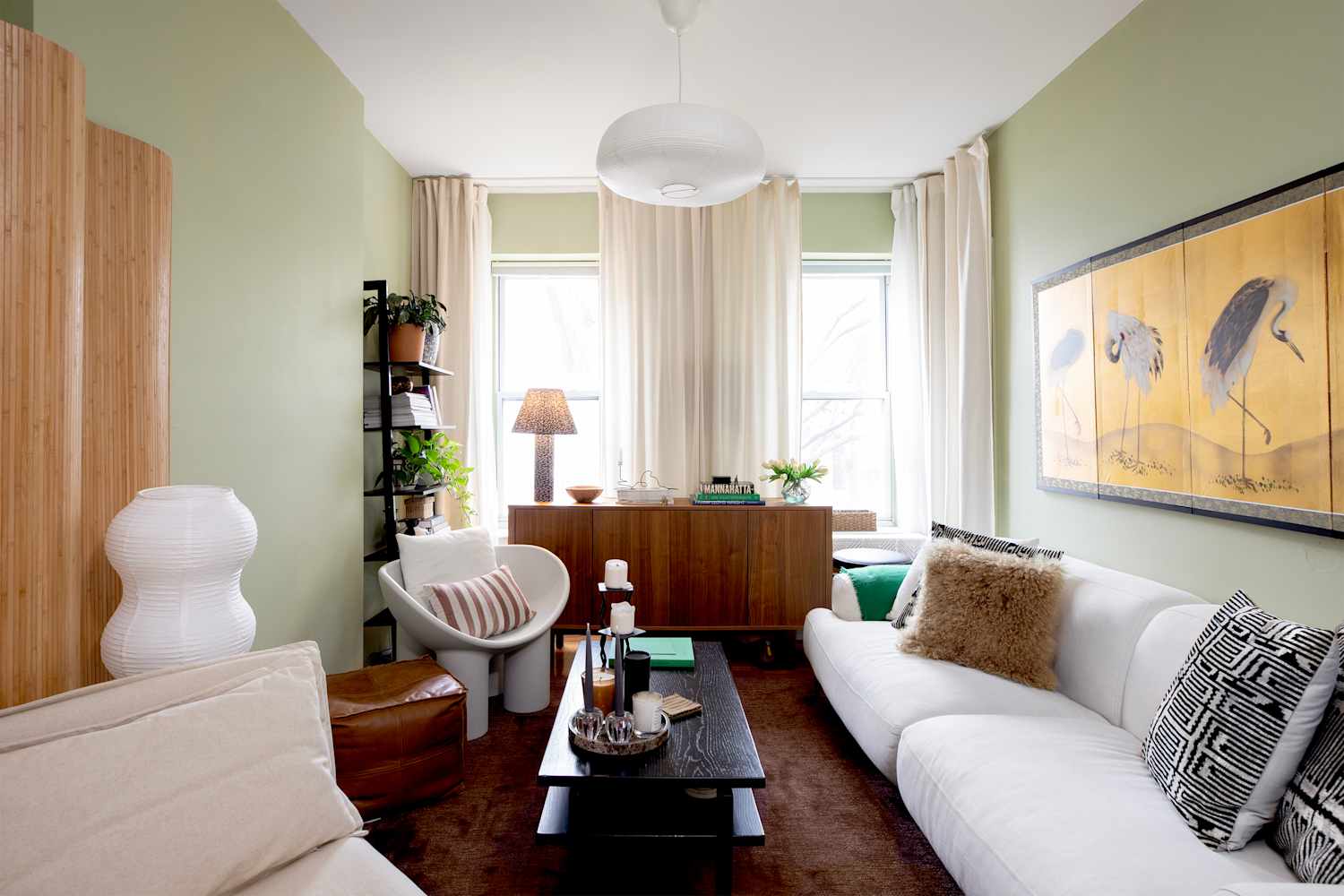
2 months ago"Instantly Calming": 8 Colors Designers Love in Trendy Japandi Interiors
If there was only one interior design style setting the tone in 2026, it would be Japandi. Apartment Therapy's State of Home Design survey identified Japandi style as one of the year's top design aesthetics, according to insights from 140 designers - and it's easy to see why. As more people strive to create spaces that feel calming, intentional, and grounded in nature, Japandi's blend of Japanese restraint and Scandinavian warmth feels especially timely.
Design


fromDesign Milk
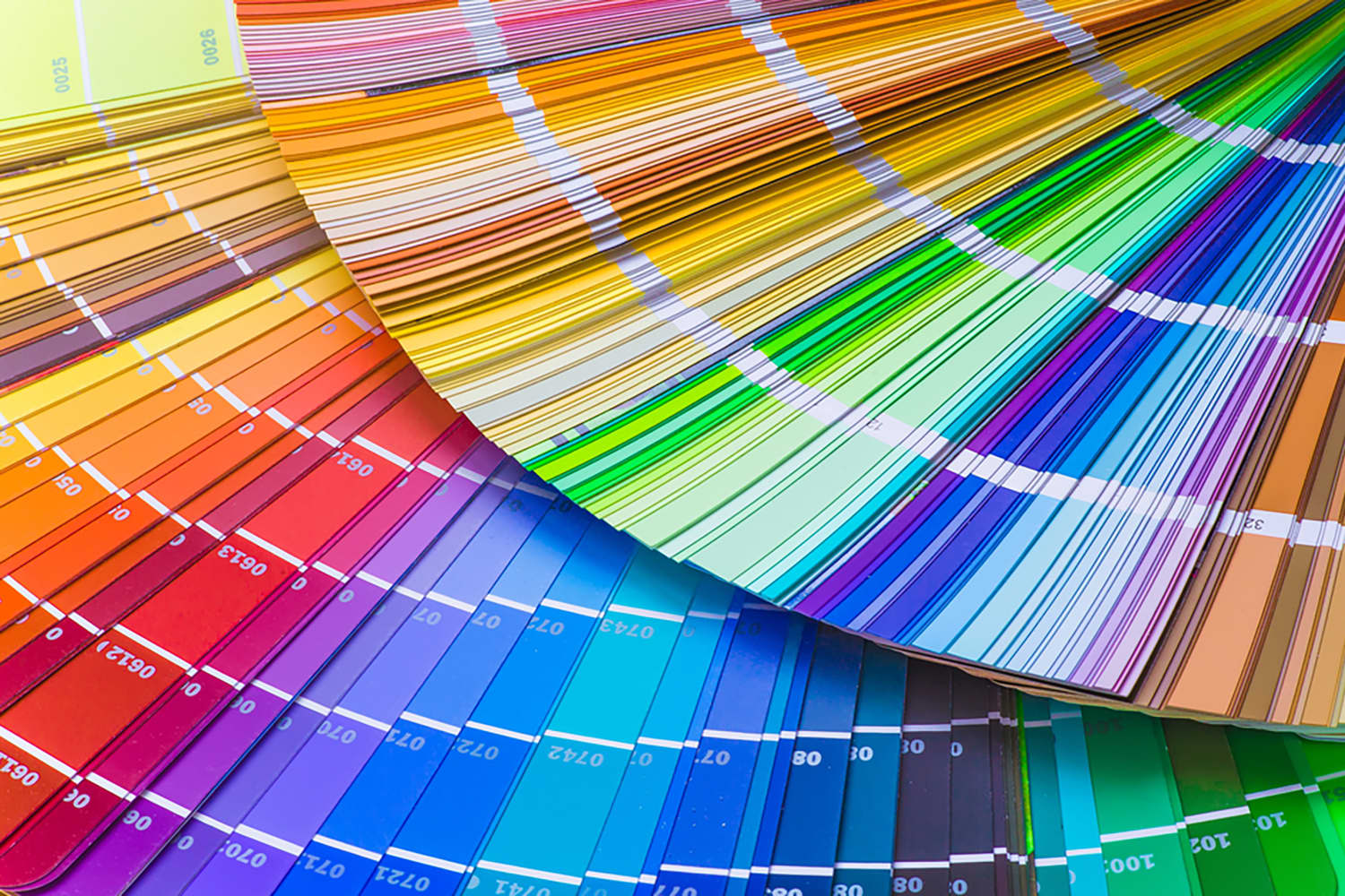
1 month agoThe 2026 Color Collection by 3form is Rooted in History
The 2026 Color Collection from 3form highlights hues that have anchored design across generations and cultures for thousands of years. The brand's sixth grouping is a departure from last year's palette, which emphasized the emotional power of select shades. With the guiding theme "Color that Connects," the new line features tones that are celebrated by communities around the globe. Inspiration for the palette came from exploring natural pigments used to make certain colors, and how they were found in various locales over time.
Remodel
fromwww.aljazeera.com
2 months agoWhy is Cloud Dancer' the colour of the year?
We examine the online debate ignited by Pantone's Colour of the Year, Cloud Dancer. This episode dives into the discussion prompted by Pantone, unpacking the uneasy relationship between colour and fascism. From hardline efforts to regulate colour in public life to the ways vibrancy and maximalism reassert themselves, we explore how colour becomes a quiet form of resistance across art, fashion, film, and design.
Design
fromApartment Therapy
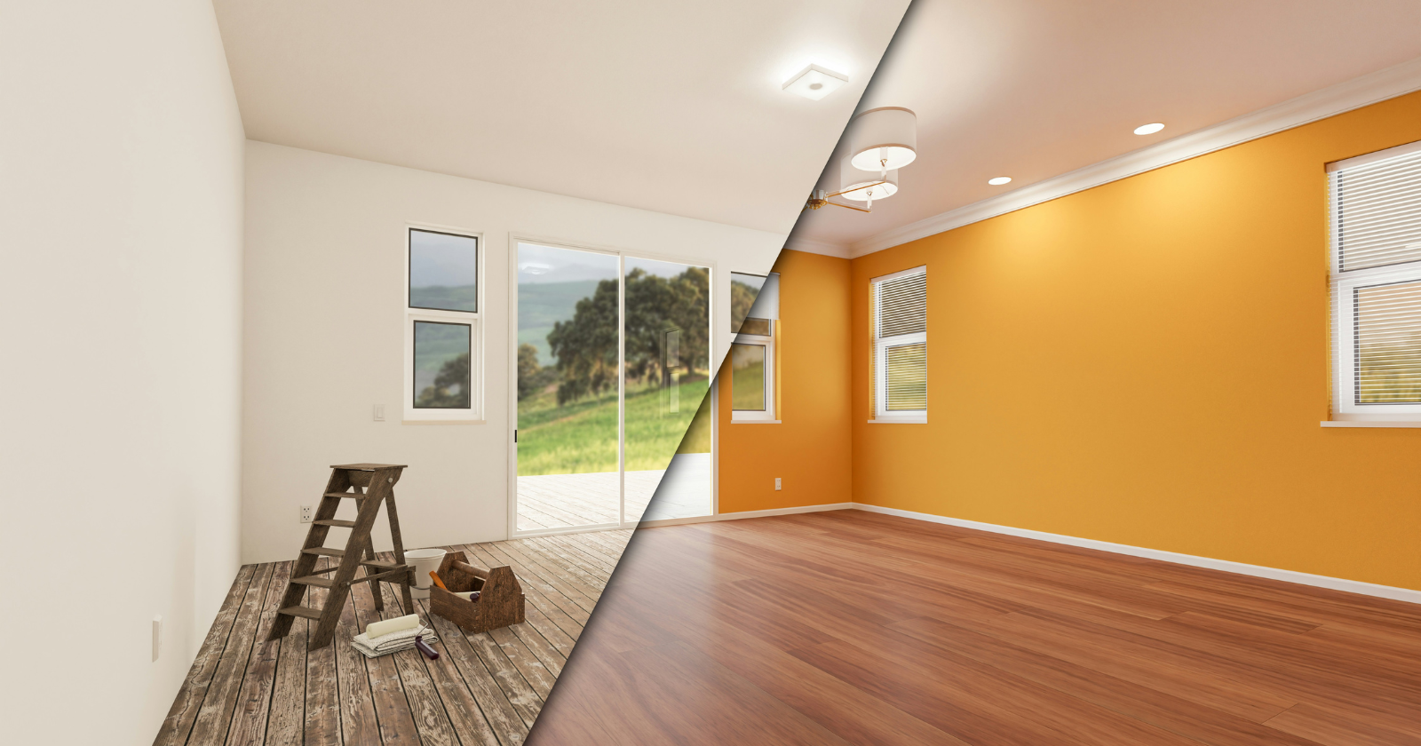
1 month agoThe Surprising Reason Butter Yellow Isn't Trending Anymore (Hint: It's Economic)
Architect-turned-interior designer Anh Ly, founder and CEO of Mim Concept, explains why the color surged in the first place: "Butter yellow had a magic moment because it felt optimistic and comforting, especially during a time when people were craving warmth at home." Now, that emotional pull is also what's working against it. "It fell short on resale since it's a very emotion-specific color. Buyers tend to see it as personal rather than neutral, which makes it harder for them to imagine themselves in the space," Ly adds.
Renovation
fromdaverupert.com
2 months agoUsing your design system colors with contrast-color()
One predictable pain point with contrast-color() is that it only returns black and white named colors. From a design systems perspective, that's not ideal because you want your colors. You want your harmonious brand and the colors you and your team spent thousands of man hours in meetings deciding on. Those colors. In fact, an earlier version of Safari had color-contrast() (confusing I know, naming is hard) which allowed you to pass in a list of best candidates to choose from. I beleive that proposal got mired in standards discussions, color contrast algorithms, and competing proposals; and contrast-color() is what survived which got simplified down to a binary result.
fromMedium
2 months agoFeelings are the new features
Your junior designer spins up a prototype in Lovable before lunch. Your PM shows you a "working" MVP built entirely with Cursor within a day. And your CEO forwards you a LinkedIn post about how AI will replace 80% of UI work by 2026. And it seems like anyone can now make an app to solve a specific problem. Has the graphical interface really died, as Jakob Nielsen provocatively suggests?
UX design
fromApartment Therapy
1 month agoWe Asked 6 Designers the Best Color for Small Bathrooms: These Shades Won
Making a small bathroom both beautiful and functional is a tall task; after all, they're often short on light, floor space and lofty ceilings. Creating a design for tiny bathrooms should focus on using every inch of space effectively - but since each of these spaces (no matter how small!) have walls, a paint color may be your most important choice.
Design
fromFast Company
2 months agoWhat 11 top designers want to redesign in 2026
Yes, there are the New Year's traditions of setting ambitious goals and ditching bad habits, but one evergreen resolution that ought to top lists is to banish bad design. Why endure something that simply doesn't work (or is an affront to aesthetics) any longer than we have to? In the spirit of fresh starts, we polled experts in architecture, tech, industrial design, and urbanism on the everyday annoyances and the big-picture issues that they think are in desperate need of a refresh in 2026.
Design
fromApartment Therapy
2 months agoThe Free Design Tool That'll Transform Your Home (It'll Look 10x Better!)
Apartment Therapy's January Cure is a free 20-day program that'll help you refresh your home for the year ahead. Sign up here and get all assignments delivered to your inbox. Go to the Mood Board homepage. Browse our collections of photos, products, and colors, or upload your own images. Tap on an image to add it to your canvas. Move, resize, crop, and layer using our smart tools. You can even add text.
Design
[ Load more ]