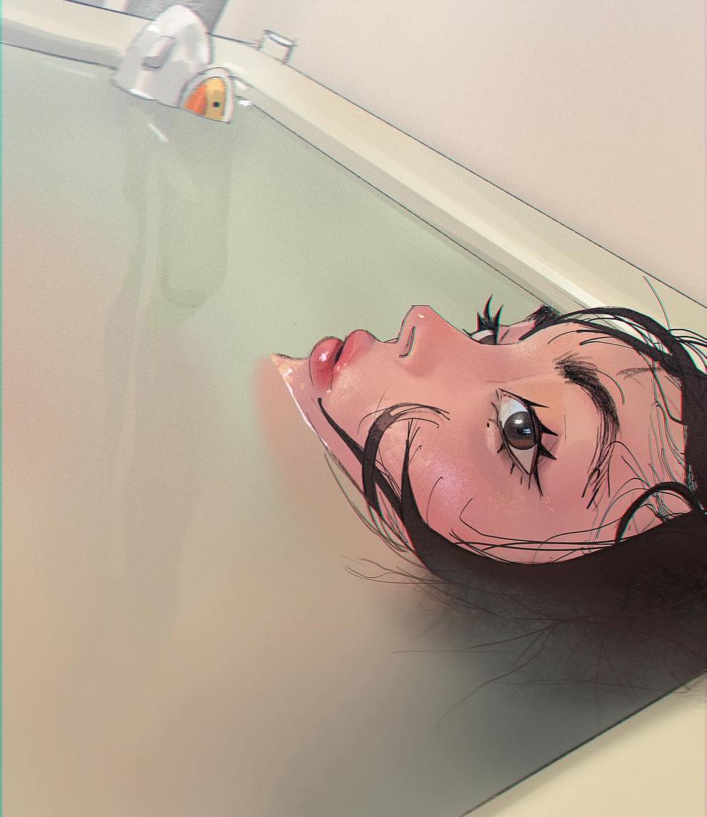
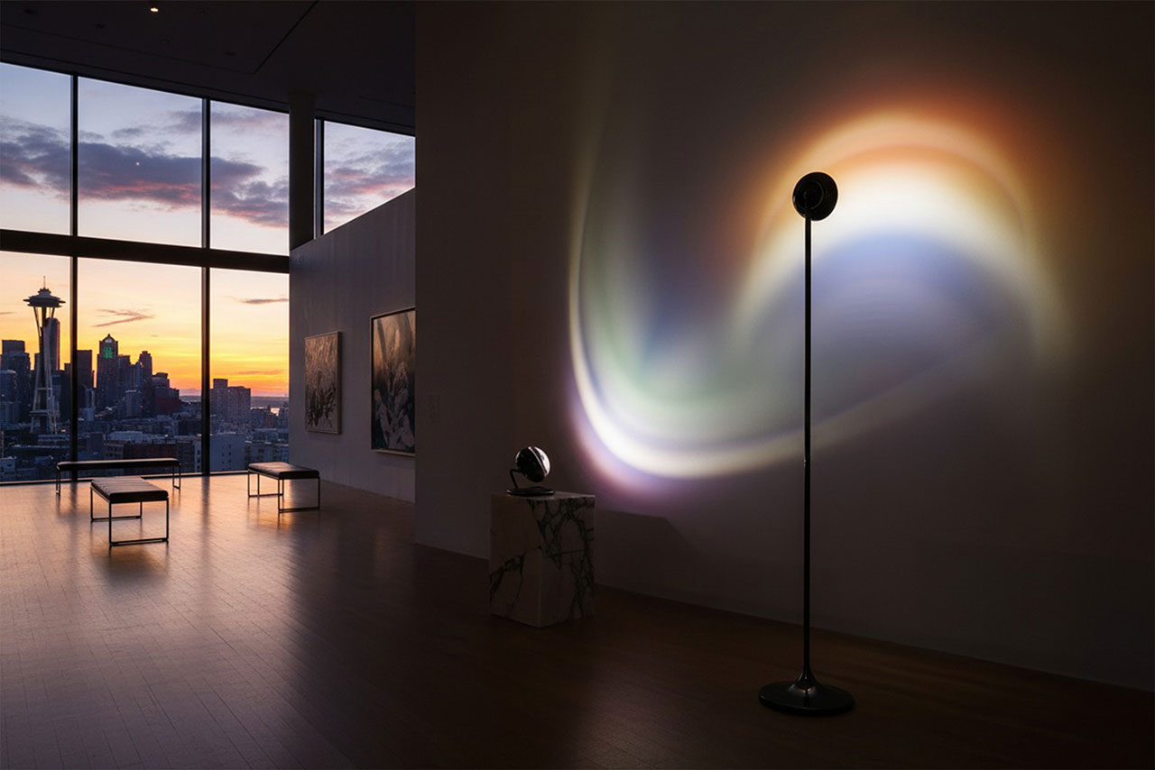
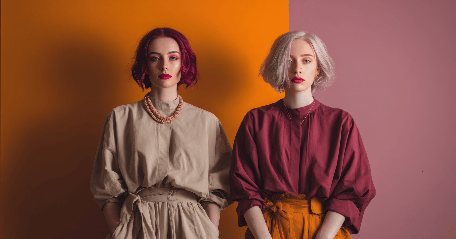
#ombre
#ombre
[ follow ]
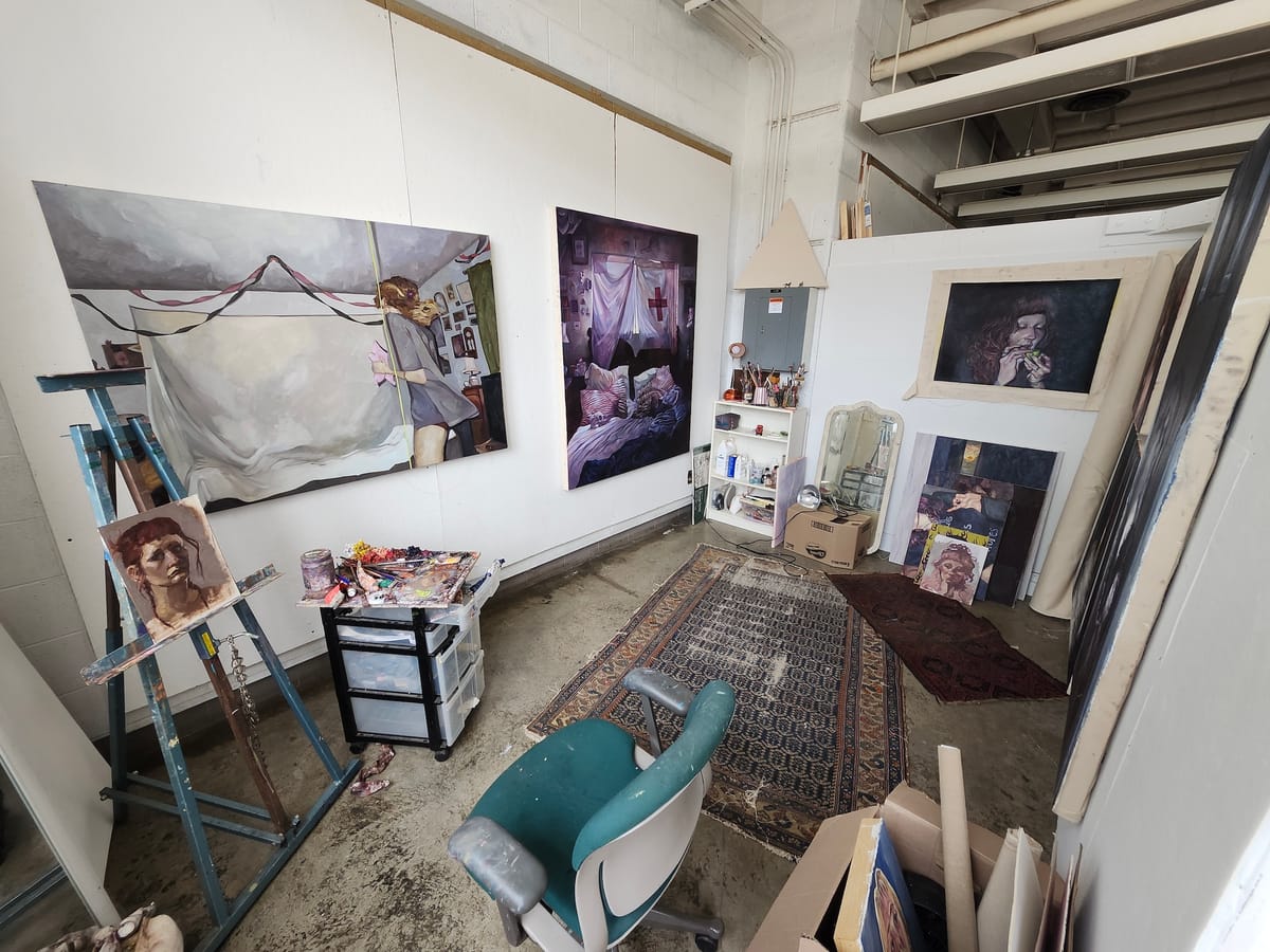
#interior-design #photography #illustration #contemporary-art #color-perception #artist-studio-practice #art

fromMail Online
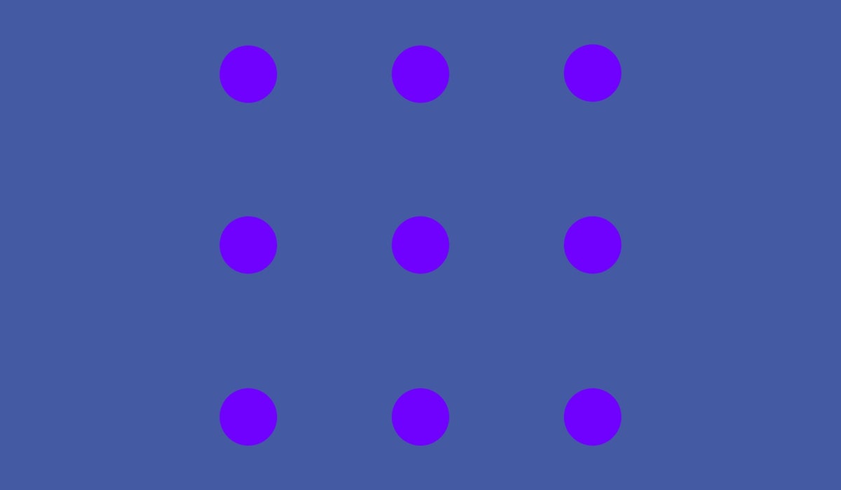
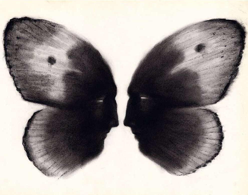
6 days agoWhat colour are the dots in this optical illusion?
'In this paper a novel optical illusion is described in which purple structures (dots) are perceived as purple at the point of fixation, while the surrounding structures (dots) of the same purple colour are perceived toward a blue hue.'
Science

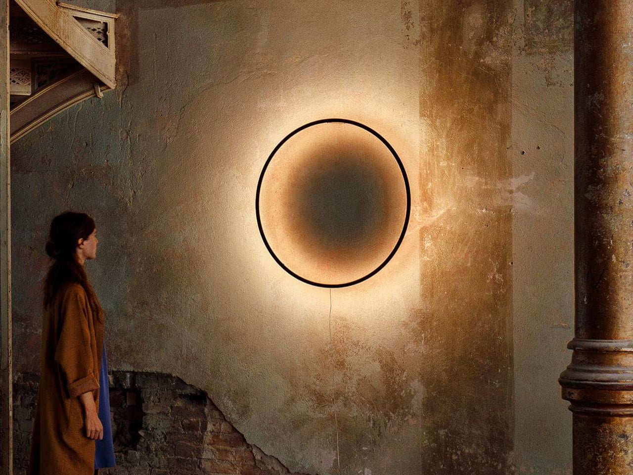
#lighting-design

Renovation
fromRedfin | Real Estate Tips for Home Buying, Selling & More
3 weeks ago5 Reasons Why Lighting Design Matters More Than You Think in Home Interiors
Thoughtful lighting design enhances home comfort, style, and well-being by supporting circadian rhythms and transforming how spaces feel and function.

Design
fromdesignboom | architecture & design magazine
2 weeks agoa rich palette of saturated hues meet industrial precision in mara's renewed digital identity
Mara enters 2026 as a global interior design protagonist, expanding from office and hospitality into residential markets while strengthening its digital identity and sustainability commitment.
fromColossal
2 weeks agoBreezy Swathes of Fabric Dance Amid Landscapes in Thomas Jackson's Photos
Rooted in the tension between nature and artificiality, the installations pose questions about how we interact with the environment and how we might find equilibrium with it. All of my photographs strain credulity by design. At first blush, they can appear to be digital fabrications, but in truth, they are entirely in-camera, printed with minimal post-production.
Photography
fromHi-Fructose Magazine - The New Contemporary Art Magazine
3 weeks agoUncanny Valley: The Oil Paintings of the Late Eyvind Earle Still Have A Resounding Influence on Artists & Viewers Today - Hi-Fructose Magazine
To call the oil paintings of Eyvind Earle "landscapes" is accurate but very sorely wanting. For more than seventy years, Earle turned his unique refracting eye on what he called the "stupendous infinity of nature," interpreting what he saw through a long lens shaped by a very particular kind of mythopoeia.
Miscellaneous
Photography
fromdesignboom | architecture & design magazine
2 weeks agoiridescent insect wings glow in chris perani's macro portraits series
Chris Perani's Wings series uses high-resolution imaging and focus stacking to reveal the microstructure, patterns, and material qualities of insect wings across multiple species.

Design
fromYanko Design - Modern Industrial Design News
3 weeks agoThese Shell-Inspired Lamps Cast Wing-Like Shadows on Your Walls - Yanko Design
Pelk lamps prioritize sculptural form over functional invisibility, using shell-inspired curved metal arcs to create dramatic lighting effects and shadows that extend the fixture's visual presence.
Graphic design
fromItsnicethat
3 weeks agoLydia Chodosh probes design rules through archiving and cataloguing
Designer Lydia Chodosh interrogates how knowledge is acquired and transmitted through language, archival systems, and interdisciplinary design practice informed by literature, publishing, and visual communication.
Graphic design
fromItsnicethat
1 month ago"A poster is a bit like a song": Jakub Zasada's geometric works are a thing of beauty
Jakub Zasada creates midcentury-inspired digital posters using minimal software functions and scanned materials, prioritizing functional design for public spaces with universal accessibility.
Books
fromwww.theguardian.com
1 month agoMy rookie era: I wasn't immediately good at oil painting, but it taught me to find pleasure in struggle
Returning to painting through oil classes helped overcome fear of judgment, teaching fundamentals, practice, and acceptance of possible failure to enjoy the creative process.
fromSubstack
1 month ago20 Design Reference Platforms Beyond Dribbble
Static images don't show motion. You can't inspect real product structure. You don't see how interfaces evolve over time. You rarely understand what actually works in production. So I decided to go deep. I reviewed every major design reference platform I could find - not just the popular ones - and analyzed how they actually help in real-world work. The conclusion?
Mobile UX
fromBoard Game Quest
1 month agoSand Art Review
Sand Art is a game by Kory Jordan and published by 25th Century Games for two to four players ages 10 and up. It takes about an hour to play, and has you collecting resources and then coloring in a bottle, making art in a bottle out of sand, in case the name didn't give away the plot. Gameplay Overview: Sand Art has you gathering and mixing sand, which is used to fill your bottle.
Board games
fromwww.kaltblut-magazine.com
1 month agoUnion of Opposites
Originally from Dallas and now based in New York City, I approach photography as an exercise in atmosphere, trust, and control. Trained in the discipline of film and later in fashion photography, I work with both natural and artificial light to construct images that feel cinematic and psychologically charged. Moving fluidly between studio and location, I transform spaces into environments that heighten mood and presence.
Fashion & style
Photography
fromdesignyoutrust.com
1 month agoStunning Digital Storytelling Landscapes By Prismofpixels, Turning Quiet Streets And Town Squares Into Cinematic Moments Of Color And Light
A curated collection of diverse visual works spanning paintings, photography, design, and historical images across eras, genres, and artistic mediums.
fromItsnicethat
1 month agoThe experimental graphic design work of Ward Goes sits at the intersection of type and materiality
A graphic designer that isn't limited to working in 2D, Ward Goes has been working in aluminium of late. His recent solo show in Rotterdam, Literally Anything, was full of things that moved beyond the screen or printed page, including some wonderful metal signage and archival storage. The exhibition at Alley Space was the result of the designer's decision to pursue more tactical investigations alongside his commissioned work at the start of 2025.
Typography
fromColossal
1 month agoWith 200+ Artworks, 'Rainbow Dreams' Revels in the Vast Creativity of the Color Spectrum
From Do Ho Suh's ethereal architecture to Kimsooja's irridescent mirrors to Lauren Halsey's fringed tapestry, a new book from Monacelli celebrates a broad spectrum of light and color. Rainbow Dreams features more than 200 installations, sculptures, paintings, photographs, and more that revel in the possibilities of pigment. Bound in a smooth gradient that extends to the pages' edges, this vivid survey is a celebratory, playful object in itself.
Books
fromdaverupert.com
2 months agoUsing your design system colors with contrast-color()
One predictable pain point with contrast-color() is that it only returns black and white named colors. From a design systems perspective, that's not ideal because you want your colors. You want your harmonious brand and the colors you and your team spent thousands of man hours in meetings deciding on. Those colors. In fact, an earlier version of Safari had color-contrast() (confusing I know, naming is hard) which allowed you to pass in a list of best candidates to choose from. I beleive that proposal got mired in standards discussions, color contrast algorithms, and competing proposals; and contrast-color() is what survived which got simplified down to a binary result.
Fashion & style
fromSilicon Canals
2 months agoWhy some women go gray gracefully while others look washed out: a colorist explains - Silicon Canals
Natural skin undertone and gray-hair condition determine whether gray hair flatters or washes out; tailoring makeup, wardrobe, and jewelry can optimize the look.
fromSmashing Magazine
2 months agoSmashing Animations Part 8: Theming Animations Using CSS Relative Colour - Smashing Magazine
I've recently refreshed the animated graphics on my website with a new theme and a group of pioneering characters, putting into practice plenty of the techniques I shared in this series. A few of my animations change appearance when someone interacts with them or at different times of day. The colours in the graphic atop my blog pages change from morning until night every day.
Web design
fromItsnicethat
2 months agoAldon Chen's exploded infographics challenge our "assumptions of sight"
In his graphic design work, Aldon transforms periodic tables and dense masses of information into maximalist pieces of design, expressing information whilst also challenging the impossibility of taking it all in. Data sprawls across screens and pages, overlapping in overloads and feedback loops, communicating more the aesthetic of information rather than its substance, playing with images we have all seen in science classes or colour palettes. These are exploded infographics.
Design
fromwww.aljazeera.com
2 months agoWhy is Cloud Dancer' the colour of the year?
We examine the online debate ignited by Pantone's Colour of the Year, Cloud Dancer. This episode dives into the discussion prompted by Pantone, unpacking the uneasy relationship between colour and fascism. From hardline efforts to regulate colour in public life to the ways vibrancy and maximalism reassert themselves, we explore how colour becomes a quiet form of resistance across art, fashion, film, and design.
Design
fromEast Bay Express | Oakland, Berkeley & Alameda
2 months agoThe color of home: 'Domestic Light' is visual immersion
Considering how this experience could be expressed artistically, he conceived "Domestic Light," which for two years used windowsill sensors in nearly 100 sites globally to record what he describes as "multispectral traces of home."
Arts
fromdesignyoutrust.com
2 months agoMatt Midgley Paints Razorsharp Geometric Acrylics So Precise They Barely Look Handmad
Death Anxiety Comics Inspired By Our Fears "Sunkissed": Beautiful Feminine Illustrations by Emilija Savic Artist Creates Honest Illustrations About Relationships And Everyday Life Artist Yana Tarakanova Creates Superb Explicit and Bizarre Comics About The Society The Dark, Incredibly F*cked Up Comics Of Joan Cornella Chris Keegan by Cosmic Creatures 6 Feet Covers: Duo Artists Re-Designed Iconic Album Covers To Promote Social Distancing Artist Spent Three Years Painting Her Readings Mom Prepares Healthy Meals As Cartoon Characters For Her Son How To Teach Yoga Like Slav: Top 10 Drunk Yoga Positions
Arts
[ Load more ]