#color-association
#color-association
[ follow ]
#interior-design #color-perception #color-psychology #user-experience #branding #identity #art #creativity

fromMail Online
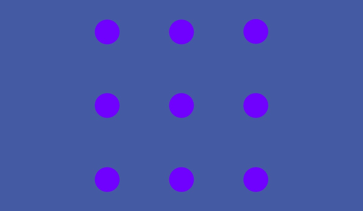
6 days agoWhat colour are the dots in this optical illusion?
'In this paper a novel optical illusion is described in which purple structures (dots) are perceived as purple at the point of fixation, while the surrounding structures (dots) of the same purple colour are perceived toward a blue hue.'
Science

Design
fromdesignboom | architecture & design magazine
2 weeks agoa rich palette of saturated hues meet industrial precision in mara's renewed digital identity
Mara enters 2026 as a global interior design protagonist, expanding from office and hospitality into residential markets while strengthening its digital identity and sustainability commitment.
Fashion & style
fromThe Globe and Mail
4 weeks agoThe business of colour analysis is booming - again
Colour analysis, a 1980s trend, has resurged as a popular service where experts determine whether individuals are Winter, Spring, Summer, or Fall based on skin, hair, and eye undertones to guide personal styling choices.
#lighting-design
Renovation
fromRedfin | Real Estate Tips for Home Buying, Selling & More
3 weeks ago5 Reasons Why Lighting Design Matters More Than You Think in Home Interiors
Thoughtful lighting design enhances home comfort, style, and well-being by supporting circadian rhythms and transforming how spaces feel and function.
fromSmashing Magazine
1 month agoFresh Energy In March (2026 Wallpapers Edition) - Smashing Magazine
Designed by artists and designers from across the globe, each wallpaper comes in a variety of screen resolutions and can be downloaded for free. A huge thank-you to everyone who shared their designs with us - this post wouldn't be possible without your kind support!
Design
fromSubstack
1 month ago20 Design Reference Platforms Beyond Dribbble
Static images don't show motion. You can't inspect real product structure. You don't see how interfaces evolve over time. You rarely understand what actually works in production. So I decided to go deep. I reviewed every major design reference platform I could find - not just the popular ones - and analyzed how they actually help in real-world work. The conclusion?
Mobile UX


fromColossal
1 month agoWith 200+ Artworks, 'Rainbow Dreams' Revels in the Vast Creativity of the Color Spectrum
From Do Ho Suh's ethereal architecture to Kimsooja's irridescent mirrors to Lauren Halsey's fringed tapestry, a new book from Monacelli celebrates a broad spectrum of light and color. Rainbow Dreams features more than 200 installations, sculptures, paintings, photographs, and more that revel in the possibilities of pigment. Bound in a smooth gradient that extends to the pages' edges, this vivid survey is a celebratory, playful object in itself.
Books
frommissionlocal.org
1 month agoPick a color
Help grow our newsroom, joining the 3,250 readers who support us by giving below. See all snaps here. To contribute, send in a headline and a snap to info@missionlocal.com. Because of you, Mission Local reached and surpassed our $300,000 year-end fundraising goal. All we can say is thank you. Thank you for choosing to invest in a local newsroom rooted in San Francisco's communities one that listens first and reports deeply.
San Francisco
fromMedium
1 month agoDesigning useful ads
We've both fought against needless promotional content before and lamented that frontier AI platforms are falling into the same pattern. As designers and users, we've learned that "free" usually means putting up with interruptive, slightly creepy ads that feel more like a tax than a benefit - a frustration tax that now colors how we approach free‑tier services and now AI tools.
Artificial intelligence
fromInsideHook
2 months agoOn Your Next Date, Go Color Hunting
"Me and my girlfriend went on color hunting in Berlin this weekend," user Erikas Mališauskas shared on X. "We picked two random colors and had to make a 3×3 photo grid featuring that color. I got yellow, she got blue, here's the result." Commenters rallied together in agreement, saying how good of an idea this is.
Relationships
fromEast Bay Express | Oakland, Berkeley & Alameda
2 months agoThe color of home: 'Domestic Light' is visual immersion
Considering how this experience could be expressed artistically, he conceived "Domestic Light," which for two years used windowsill sensors in nearly 100 sites globally to record what he describes as "multispectral traces of home."
Arts
fromdaverupert.com
2 months agoUsing your design system colors with contrast-color()
One predictable pain point with contrast-color() is that it only returns black and white named colors. From a design systems perspective, that's not ideal because you want your colors. You want your harmonious brand and the colors you and your team spent thousands of man hours in meetings deciding on. Those colors. In fact, an earlier version of Safari had color-contrast() (confusing I know, naming is hard) which allowed you to pass in a list of best candidates to choose from. I beleive that proposal got mired in standards discussions, color contrast algorithms, and competing proposals; and contrast-color() is what survived which got simplified down to a binary result.
fromPsychology Today
1 month agoWhy Your Eyes Like What Your Eyes Like
Real estate with ocean views, stunning mountain vistas, and wide-open green spaces sell at premium prices because humans find those settings pleasing [1-5]. Certain color combinations in fashion-such as brown and forest green-blend harmoniously, while others, such as hot pink and orange, clash. And our eyes like certain proportions in visual objects (like buildings and human faces) but not others.
Science
fromApartment Therapy
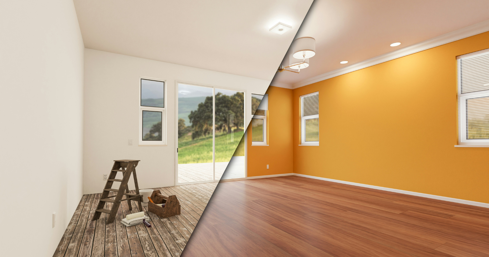
1 month agoThe Surprising Reason Butter Yellow Isn't Trending Anymore (Hint: It's Economic)
Architect-turned-interior designer Anh Ly, founder and CEO of Mim Concept, explains why the color surged in the first place: "Butter yellow had a magic moment because it felt optimistic and comforting, especially during a time when people were craving warmth at home." Now, that emotional pull is also what's working against it. "It fell short on resale since it's a very emotion-specific color. Buyers tend to see it as personal rather than neutral, which makes it harder for them to imagine themselves in the space," Ly adds.
Renovation


fromDesign Milk
1 month agoThe 2026 Color Collection by 3form is Rooted in History
The 2026 Color Collection from 3form highlights hues that have anchored design across generations and cultures for thousands of years. The brand's sixth grouping is a departure from last year's palette, which emphasized the emotional power of select shades. With the guiding theme "Color that Connects," the new line features tones that are celebrated by communities around the globe. Inspiration for the palette came from exploring natural pigments used to make certain colors, and how they were found in various locales over time.
Remodel
fromBored Panda
2 months ago80 Vintage Ads That Show Which Values Changed And Which Stayed The Same Over Time
We might be exposed to more ads and commercials today than ever before in human history, but the idea of advertising itself is certainly not a new concept. According to Instapage, the first signs of advertisements actually appeared in ancient Egyptian steel carvings from 2000 BC. Meanwhile, the first printed ad was published in 1472, when William Caxton decided to advertise a book by posting flyers on church doors in England.
Marketing
fromSmashing Magazine
2 months agoSmashing Animations Part 8: Theming Animations Using CSS Relative Colour - Smashing Magazine
I've recently refreshed the animated graphics on my website with a new theme and a group of pioneering characters, putting into practice plenty of the techniques I shared in this series. A few of my animations change appearance when someone interacts with them or at different times of day. The colours in the graphic atop my blog pages change from morning until night every day.
Web design
fromwww.aljazeera.com
2 months agoWhy is Cloud Dancer' the colour of the year?
We examine the online debate ignited by Pantone's Colour of the Year, Cloud Dancer. This episode dives into the discussion prompted by Pantone, unpacking the uneasy relationship between colour and fascism. From hardline efforts to regulate colour in public life to the ways vibrancy and maximalism reassert themselves, we explore how colour becomes a quiet form of resistance across art, fashion, film, and design.
Design
fromFast Company
2 months agoPantone just made a color matching starter kit for only $99
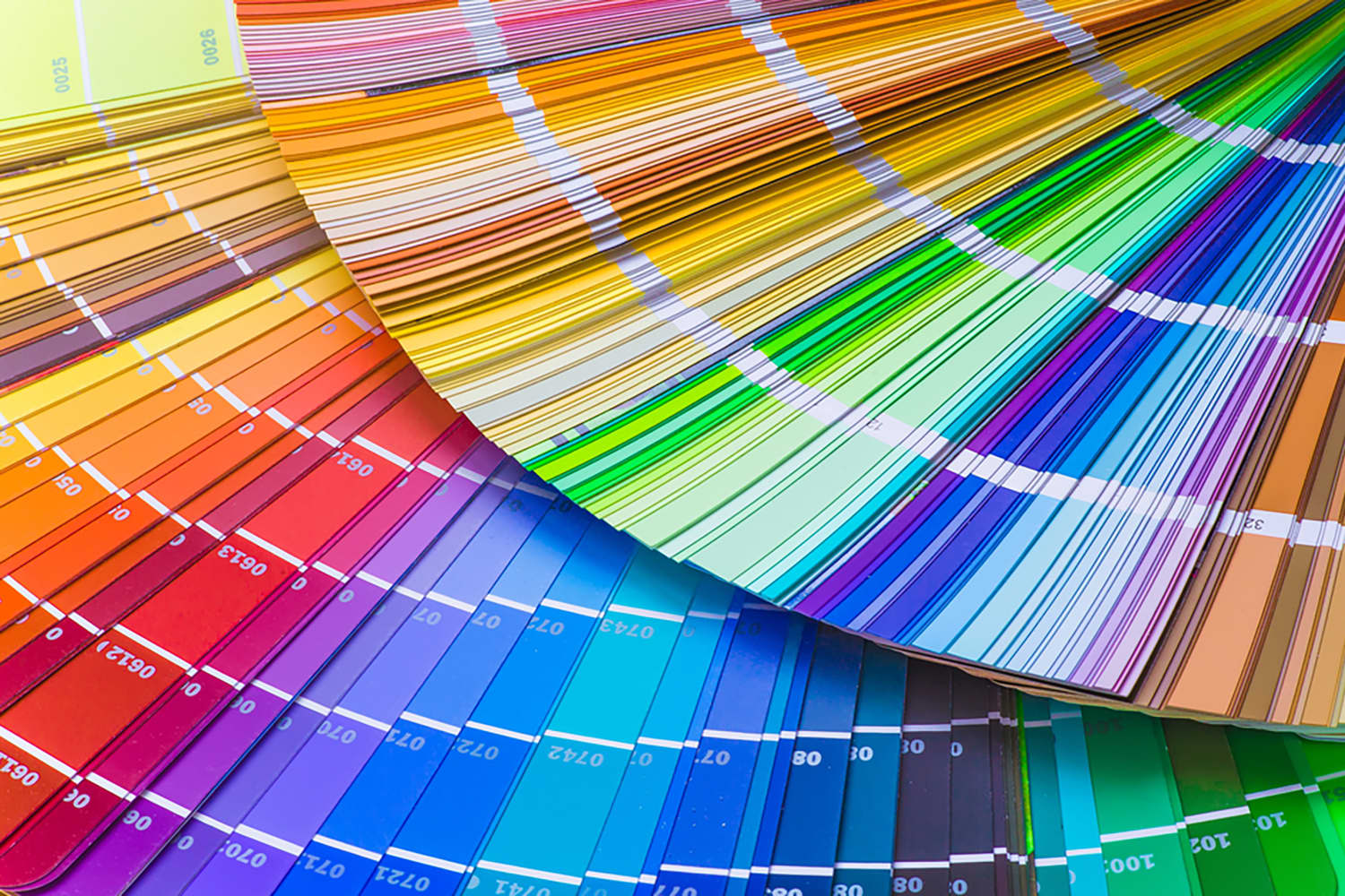
Its newest, though, is a single-fan book with more than 600 spot colors, and it's priced at just $99. Pantone for beginners. Pantone on Thursday announced its Pantone Capsule: Signature Edition. Housed in a collectible, cylindrical case that wouldn't look out of place in a Sephora, the guide is a sort of Pantone 101 that come on coated and uncoated paper stock with colors selected from across more than 60 years of Pantone history.
Design
fromItsnicethat
2 months agoAldon Chen's exploded infographics challenge our "assumptions of sight"
In his graphic design work, Aldon transforms periodic tables and dense masses of information into maximalist pieces of design, expressing information whilst also challenging the impossibility of taking it all in. Data sprawls across screens and pages, overlapping in overloads and feedback loops, communicating more the aesthetic of information rather than its substance, playing with images we have all seen in science classes or colour palettes. These are exploded infographics.
Design
fromApartment Therapy
1 month agoWe Asked 6 Designers the Best Color for Small Bathrooms: These Shades Won
Making a small bathroom both beautiful and functional is a tall task; after all, they're often short on light, floor space and lofty ceilings. Creating a design for tiny bathrooms should focus on using every inch of space effectively - but since each of these spaces (no matter how small!) have walls, a paint color may be your most important choice.
Design
[ Load more ]